fitbylevelup.com
Landing Page Analysis
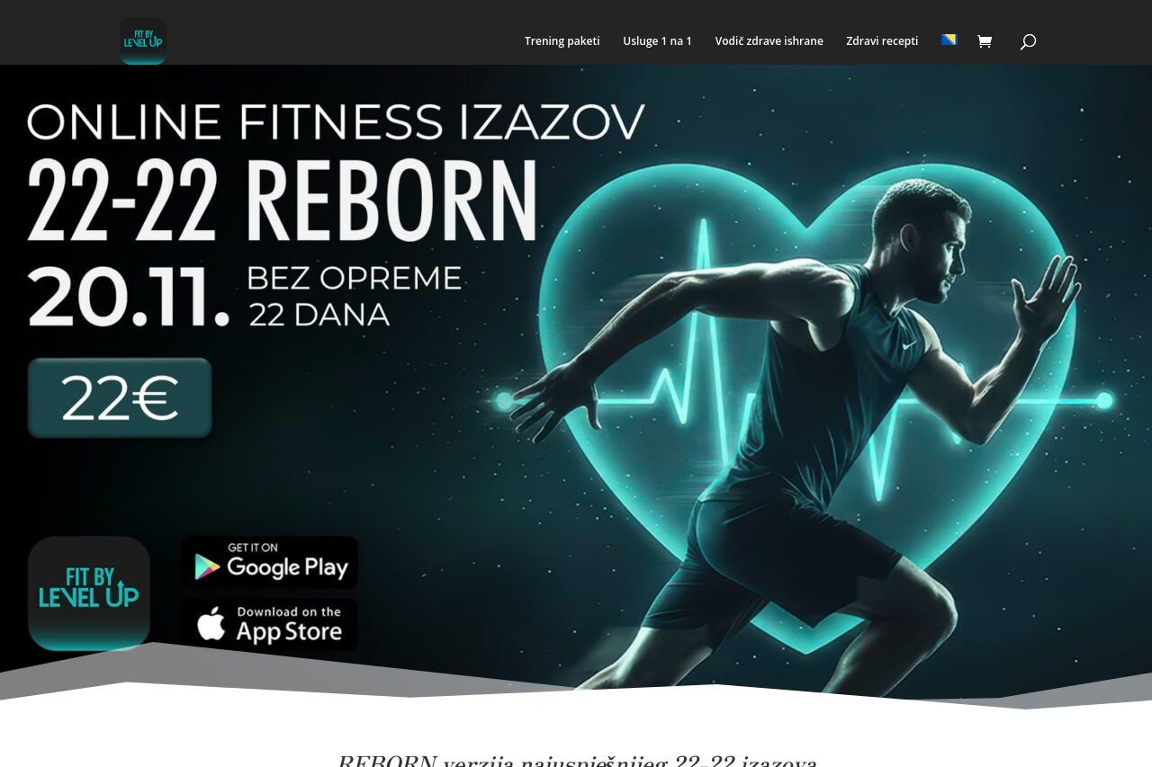
REBORN verzija najuspješnijeg 22-22 izazova
68
Share on:
Summary:
60
Messaging
55
Readability
70
Structure
65
Actionability
70
Design
70
Credibility
The landing page presents both strengths and glaring weaknesses. The bold design and energetic visuals immediately catch attention, aligning well with the fitness challenge theme. However, the text-heavy sections with overwhelming blocks of content make it difficult to absorb information quickly. While there is a clear focus on the 22-22 Reborn program, the call to actions (CTAs) are repetitive and lack urgency or creativity in language. Testimonials and before-and-after images provide valuable social proof but could be better highlighted to enhance credibility further. Overall, the page struggles with clarity and ease of navigation, despite having a clear end goal in sight.
Main Recommendations:
- Simplify and shorten the text for better readability.
- Diversify CTA language to increase engagement.
- Highlight testimonials and transformations more effectively.