vibeverify.com
Landing Page Analysis
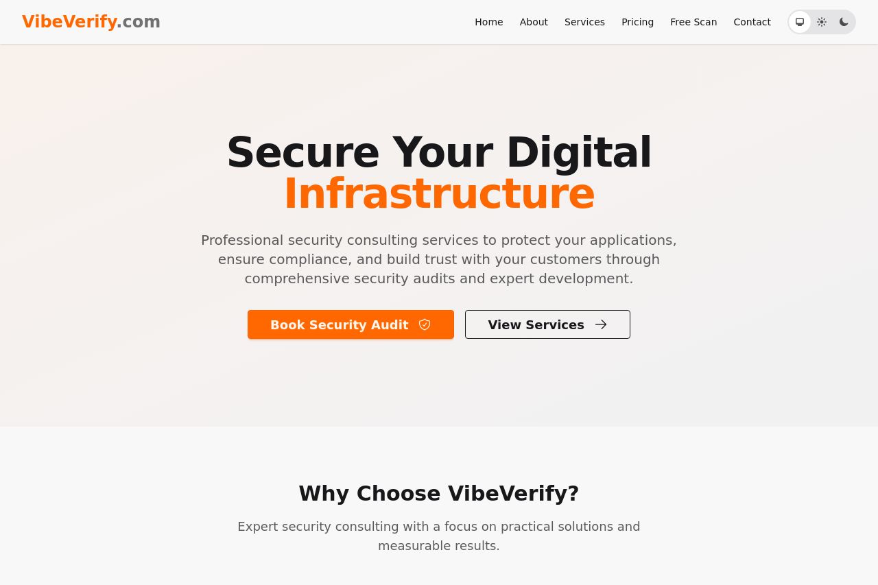
Professional security consulting services to protect your applications, ensure compliance, and build trust with your customers through comprehensive security audits and expert dev
Summary:
The landing page does a solid job of communicating its primary goal: securing digital infrastructure through professional security consulting services. However, it falters in several critical areas that could impede engagement and conversion.
**Firstly, the Secure Your Digital Infrastructure headline in bold, dark text is clear and engaging, but the subtext gets too buried and lacks succinctness, which may confuse users about the unique value VibeVerify offers. Additionally, the call-to-action buttons like Book Security Audit stand out with a bright orange, yet they are competing with less action-oriented options such as View Services, reducing focus and urgency.
The text content is devoid of personalization and distinct persuasive elements that align directly with startup founders, who are the target audience. While benefits like "Comprehensive Audits," "Expert Development," and "Trusted Partnerships" are laid out, they lack the depth of real-world examples or case studies that would create connection and trust.
**Design-wise, the color scheme is congruent with the security theme, yet it needs more diversity in contrast to help separate categories of information for better user flow. The font is easy to read, but the page leans towards being overly conservative without visuals or interactive elements that engage the visitor.
The bottom sections such as pricing are bluntly laid out; the actual pricing structure comes as a surprise at the bottom without prior lead-up or context given earlier in the page.
In summary, VibeVerify's page is clean and clear but doesn't fully harness the potential of engaging its audience, which can be improved with stronger, direct messaging and visual enhancements.
- Clarify and enhance the main value proposition to include specifics about what sets your services apart from competitors.
- Revise the CTA strategy to focus on primary actions (e.g., "Book Now") and eliminate distracting secondary CTAs.
- Utilize real-world examples or case studies specifically targeting startup needs to build trust and relevance.
- Improve visual hierarchy and contrast to guide the user's eye effectively through the page.
- Integrate more interactive or visual elements to break up text and engage users.