nameknow.com
Landing Page Analysis
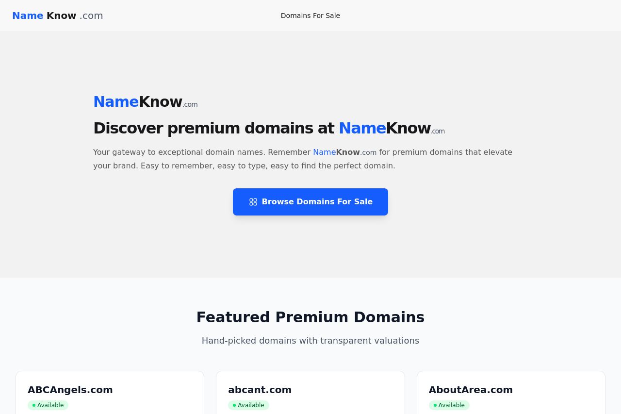
Discover premium domains at NameKnow.com
Summary:
The landing page of NameKnow.com gives off a clean and straightforward vibe, but it lacks the punch needed to capture the attention of startup founders and brand consultants. The value proposition is present but not prominent enough; it’s buried under the headline “Discover premium domains at NameKnow.com,” which could have been more engaging. The "Browse Domains For Sale" button is decent, but it doesn't create urgency or excitement to explore.
Design elements are somewhat consistent; however, there's a lack of depth in visual hierarchy. The font sizes are not making important elements stand out as much as they should. The color scheme feels generic — it's neither offensive nor engaging. In terms of readability, the text is simple and avoids technical jargon, which is a plus. Nonetheless, it misses out on a captivating narrative that would make the offering irresistible.
Furthermore, there's no strong social proof like testimonials or reviews visible on the page to build credibility. While trust elements like valuations are present, they could be emphasized more effectively. The structure is too linear and basic, giving an impression that more detail and interactivity could be added.
Overall, there's a need to make the page more vibrant and persuasive, focusing more on creating an emotional connection with potential buyers.
- Make the value proposition more engaging and bold.
- Add testimonials or reviews to enhance credibility.
- Improve the visual hierarchy and use of color to highlight key elements.