jeel1445.com
Landing Page Analysis
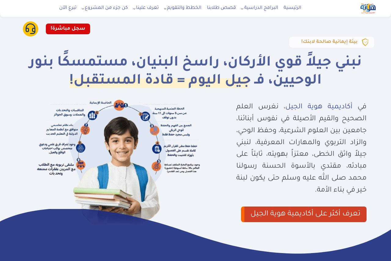
في أكاديمية هوية الجيل، نغرس العلم الصحيح والقيم الأصيلة في نفوس أبنائنا، جامعين بين العلوم الشرعية، وحفظ الوحي، والزاد التربوي والمهارات المعرفي.
Summary:
The page feels quite packed, and there's a lot going on visually which can be distracting. The main message of building a strong generation is evident, but it could be more concise. The hero section is cluttered with text and images, making it hard to focus. There is some attempt to use a color scheme, but it's not consistent enough, leading to visual confusion. Text readability is impacted by the overwhelming amount of content crammed into one space. Consistency issues are noticeable with varying icon styles and typography.
The call to action is unclear and doesn't stand out. Despite the clutter, there's a good focus on values and education, but the delivery is messy. The credibility section isn't prominent and might leave viewers questioning legitimacy. White space is underutilized, contributing to a cramped feel.
- Simplify the layout to make the main message clearer.
- Increase contrast between text and background for readability.
- Use more consistent colors and typography throughout the page.