tupausa.com
Landing Page Analysis
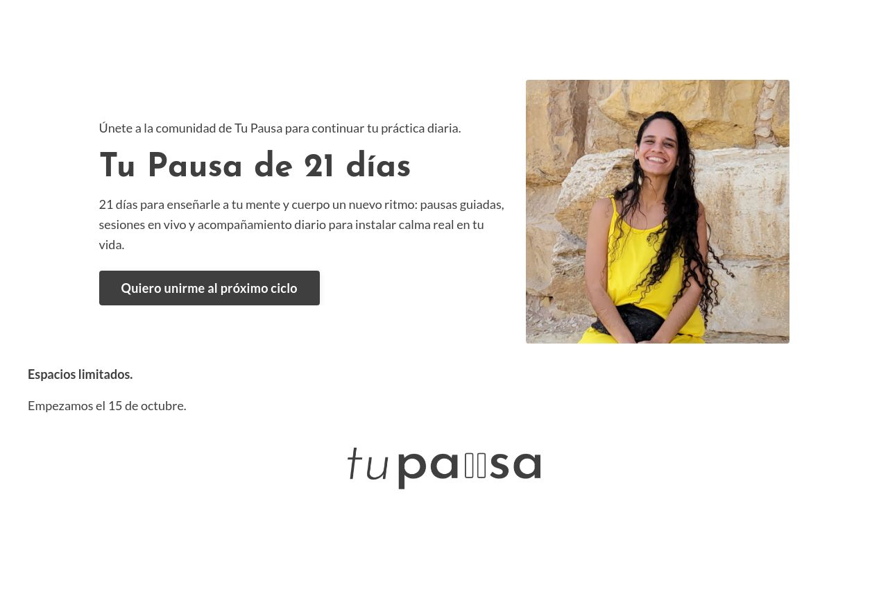
Únete a la comunidad de Tu Pausa para continuar tu práctica diaria.
Summary:
The landing page has a clear focus on promoting a 21-day challenge with specific sections like the hero section, testimonials, and pricing, which are structured logically. However, there are some weak points:
The main value proposition lacks clarity and could be more compelling to attract busy professionals. The use of color and typography is consistent and easy to read, but the page feels visually monotonous at times.
The CTAs are placed strategically but don't pop out enough against the background; they could benefit from more vibrant and contrasting colors. The credibility is supported by testimonials, but additional trust signals like badges or more detailed founder information would help.
In summary, while the design is cohesive, some elements lack urgency and strong visual appeal to truly drive conversions.
- Enhance the main value proposition to clearly explain the unique benefits.
- Adjust CTA button colors to make them stand out more.
- Add additional trust elements like badges or media mentions.