shipybara.com
Landing Page Analysis
Shipybara is a platform to discover and upvote the best tech products. Find top products launching daily.
75

Share on:
Summary:
65
Messaging
75
Readability
70
Structure
60
Actionability
80
Design
80
Credibility
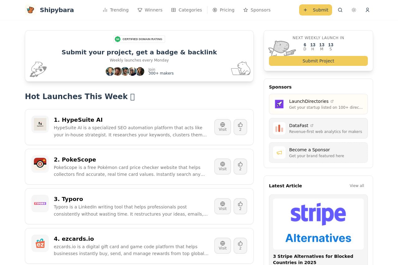
Shipybara's landing page does a decent job of showcasing trending tech launches. The "Hot Launches This Week" section is eye-catching, ensuring users know they’re looking at fresh content. The design is generally easy on the eyes, with a consistent color scheme and a clean layout. However, the page is overly text-heavy in some sections, making it cumbersome to browse quickly. The lack of a clear, powerful call-to-action is notable, as is the use of generic CTAs like "Submit Project". Social proof is visible but could be more professionally integrated.
Main Recommendations:
- Refine the call-to-action to be more action-oriented and engaging.
- Condense text-heavy sections for quicker browsing.
- Improve the integration and visibility of testimonials or social proof.