bichtrampham.com
Landing Page Analysis
Hi, I'm Bich Trâm Pham, a french digital designer based in Paris. I am currently searching for a job or remote.
Summary:
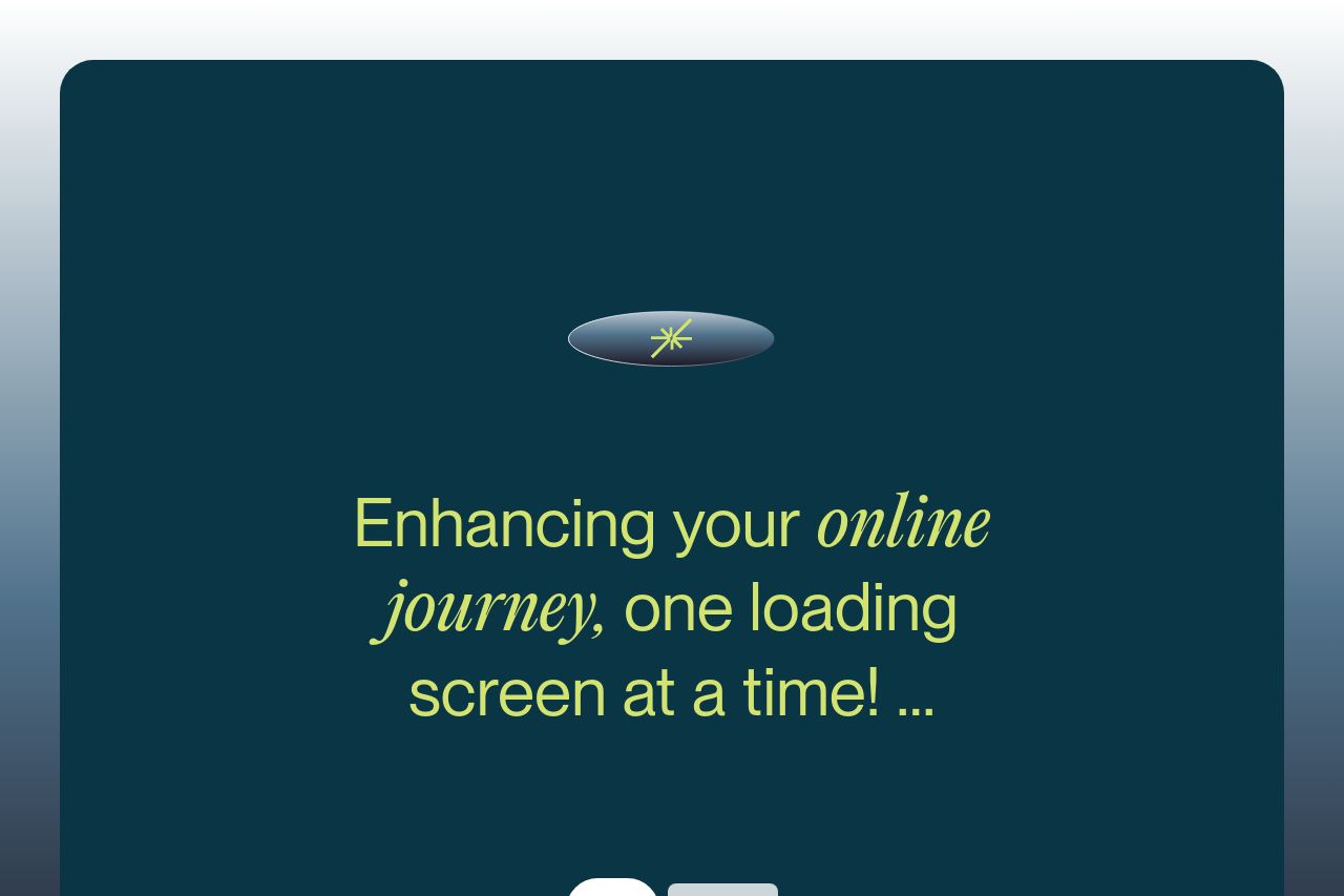
The landing page for Bich Tram Pham is visually striking with its elegant typography and consistent color scheme. The use of navy and lime creates a professional yet creative vibe. However, it falls short in communicating a clear value proposition. While there's mention of building a 'memorable design experience', there isn't a concise explanation of services or unique selling points at first glance. The testimonials section helps establish credibility, but they could be more prominently displayed. The layout is mostly well-structured but lacks strong call-to-action elements that stand out. Overlapping text elements in the hero section might confuse users. Overall, it exudes a high level of design sophistication but needs improvements in clarity and conversion strategies.
- Include clearer and more action-oriented CTAs in each section to guide user action.
- Define and articulate a stronger value proposition upfront with specific examples or case studies.
- Enhance the readability by simplifying the text and reducing overlapping elements.