go-offline.ai
Landing Page Analysis
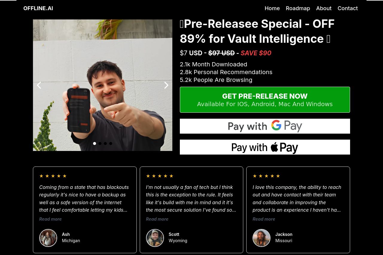
OFFLINE.AI
Summary:
The landing page for OFFLINE.AI attempts to create urgency and highlight a massive discount, but it comes off as cluttered and lacks clarity. The countdown timer feels a bit too pushy, and the CTA is repetitive. While the testimonials seek to enhance credibility, they provide limited authentic detail. The page's design is overly busy, with too much text crowded together, and the alignment is off, making it visually unappealing. Some graphics and icons do not enhance user understanding or engagement. Pricing is clear, but the value proposition could be more directly communicated to appeal specifically to preppers who value quick, reliable information about backup and security. Overall, the design and messaging need a cohesive strategy to better engage the target audience.
- Simplify the hero section to make the message clearer.
- Improve CTA differentiation to avoid blending with text.
- Enhance visual hierarchy with better use of font sizes and colors.