uxcanvas.ai
Landing Page Analysis
Create functional, beautiful UI/UX designs in real-time through natural conversation. Our AI-powered tool instantly converts your requirements into modern frontend code using HTML, Tailwind CSS, and R
Summary:
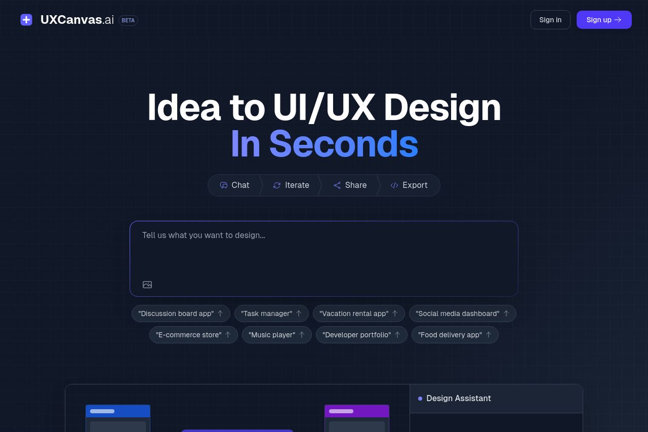
The landing page for UXCanvas.ai is a mixed bag of polished elements and notable misses.
Strengths lie in the overall aesthetic and visual consistency, with a color scheme that aligns well with the tech-savvy, modern audience. The use of dark mode is fitting for the design toolbox vibe, and the typography generally supports readability. The main headline is direct, indicating the speed of achieving UI/UX designs.
However, the CTA is pretty mediocre. It's a bit generic and doesn't emphasize urgency or offer compelling value. It's also not as visually distinguished as it could be to grab attention. Describing the extensive capabilities without tangible previews or demos feels too abstract and the audience definition is shaky at best. Vague offers of "powerful features" don't effectively convey why this service is a standout solution.
Structurally, the information is logically laid out but could be more engaging. The process section uses steps, which is a good touch, but some sections seem repetitive without offering new insights. Social proof feels almost non-existent. A big miss in establishing credibility right off the bat.
- Enhance the CTA by making it more action-oriented. Use words like 'Try Now' or 'Start Designing'.
- Incorporate more specific examples or a video demonstration directly related to the headline message.
- Add clear testimonials or recognizable logos to build trust.
- Emphasize the main unique features in a more focused way to differentiate from competitors.