refliply.com
Landing Page Analysis
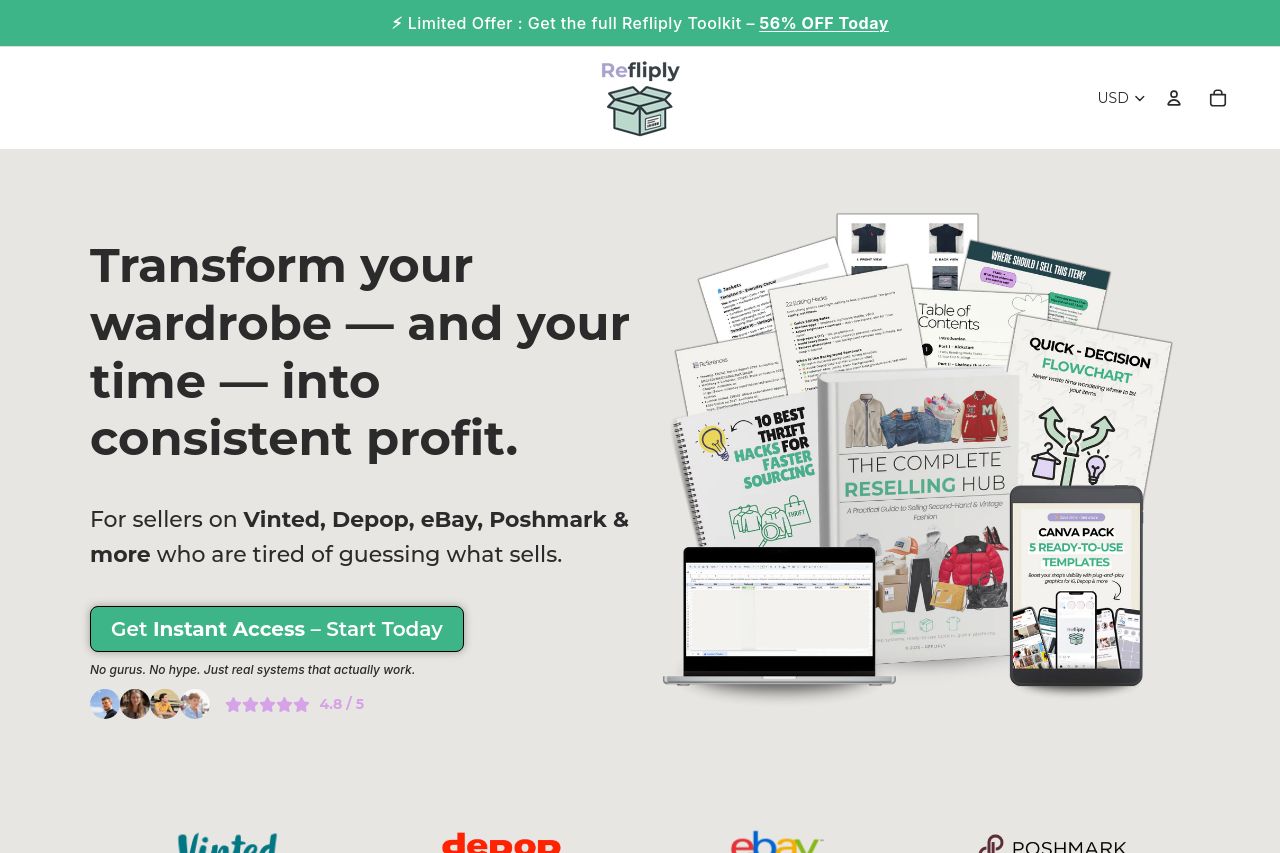
Start or scale your second-hand reselling business with Refliply. Get instant digital guides and toolkits to help you find, list, and sell profitable pre-loved fashion on Vinted, Depop, eBay, and Posh
Summary:
Overall, the page is quite effective in its approach but misses the mark in a few areas.
The value proposition is solid and clear — it communicates what Refliply offers and who it’s for. The design is consistent with a good color scheme, but could benefit from stronger visual hierarchy to enhance readability. The CTAs are visible but need more action-oriented language to drive conversions. Credibility is bolstered with reviews and industry logos, but could improve with more trust signals. The structure supports an intuitive flow, though some sections could be condensed for better focus.
- Enhance CTA language to be more action-oriented and urgent, e.g., 'Transform Your Sales Now.'
- Improve visual hierarchy with bolder headings and better spacing to break up text.
- Increase trust signals, such as more client logos and a detailed founder introduction.