investably.blog
Landing Page Analysis
Investably offers practical investment tips for young and old, with or without a big budget. Learn smart strategies and insights to grow your wealth.
Summary:
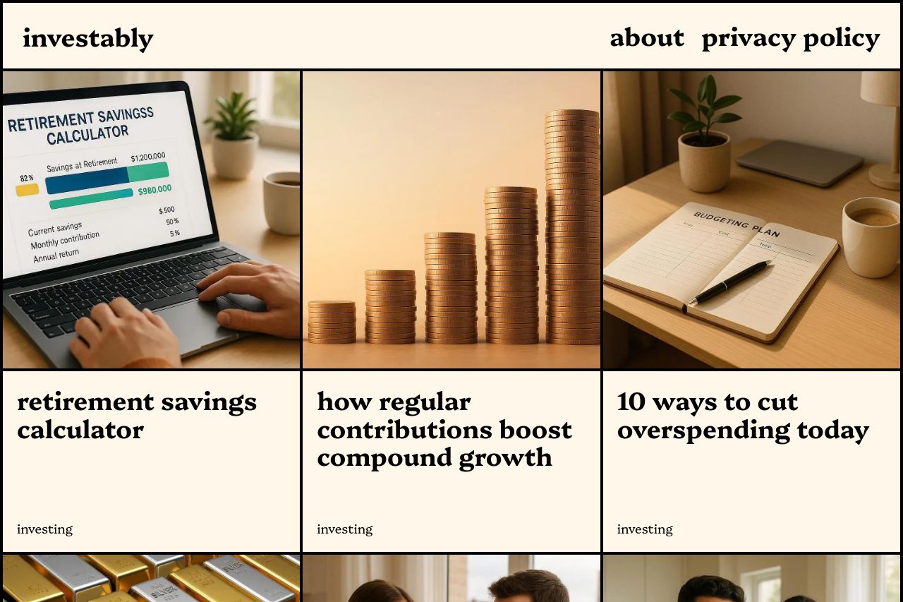
Investably's landing page does manage to keep things simple, but at the cost of engagement. The value proposition is muddy, lacking in clear benefits and features. Images related to categories like 'investing' show potential, but they don't interact well with the text, leaving gaps in understanding. The layout is straightforward and the color scheme is dull, barely enough contrast to distinguish between sections. While the grid layout helps readability, it's visually boring and doesn't guide the user through the page. No clear CTAs create a sense of aimlessness. Lacks clear social proof, which is crucial to gain trust in the finance sector. Overall, the page feels like it's standing still, which is risky in a competitive field.
- Define a stronger value proposition by clarifying what differentiates this site from others.
- Add clear CTA buttons, like 'Learn More' under each article heading.
- Integrate testimonials or trust markers for credibility.