thejanjacob.com
Landing Page Analysis
Building simple and profitable education businesses
Summary:
The landing page is clearly targeted at individuals interested in transforming their expertise into profitable businesses, but it lacks clarity and focus in several areas. The main value proposition attempts to be clear, yet the language is somewhat convoluted, reducing its impact. It offers two options for products or services, but doesn’t adequately differentiate them or explain the benefits thoroughly. The use of WhatsApp as a contact method feels informal and less professional, which might deter some users.
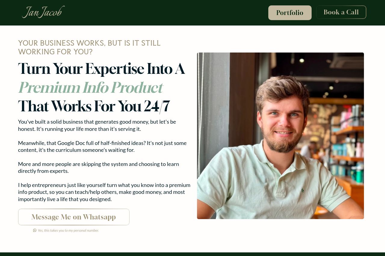
Visually, the page uses a subdued color palette with a heavy reliance on greens, which some may find uninviting. The typography is inconsistent, with a mix of weights and styles that don't always seem purposeful, leading to potential confusion about what's important. The structure lacks clear information hierarchy, with significant details sometimes buried in long paragraphs.
The CTA buttons, such as "Message Me on Whatsapp," are easily overlooked due to a lack of contrast and prominence, and the visuals don't do enough to support the messaging. The testimonials section is a strong area, helping add trust and credibility, although both formatting and CTA placement need an overhaul to be more persuasive.
- Improve overall color contrast for better readability and engagement.
- Clarify the key value proposition with more direct language.
- Make CTAs more visually distinct to increase interaction.