x20.io
Landing Page Analysis
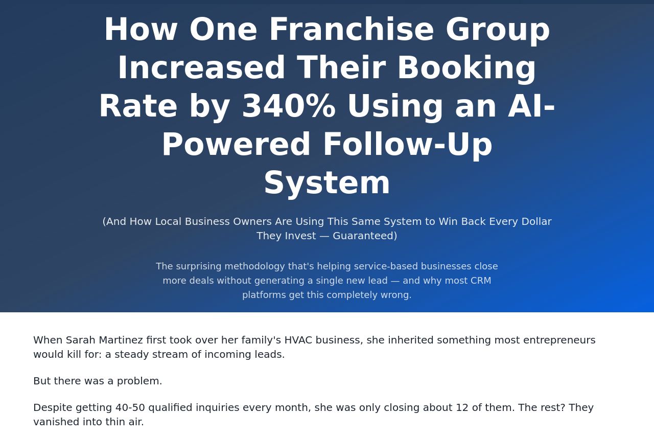
(And How Local Business Owners Are Using This Same System to Win Back Every Dollar They Invest — Guaranteed)

Summary:
The landing page does a great job of addressing pain points and illustrating the benefits through compelling storytelling. The use of specific numbers and case studies makes the content persuasive, especially for business owners looking to improve efficiency and results. However, it fails to stand out in a few key areas. The hero section's headline is impactful, but the sub-headline could be condensed for clarity. The value proposition can initially seem a bit buried in long-winded text, reducing its immediate impact. The design is clean and professional but somewhat plain, lacking visual excitement that could hold attention longer. The use of testimonials and real-world results is strong, enhancing credibility, although some more clear and prominent display of customer logos could further boost trust. Overall, while the messaging is quite strong, there is a need for a punchier presentation and better visual hierarchy to immediately grab attention.
- Condense the sub-headline in the hero section for quicker impact.
- Enhance the visual appeal with more vibrant and engaging graphics.
- Improve CTA prominence with contrasting colors.