shouldibald.com
Landing Page Analysis
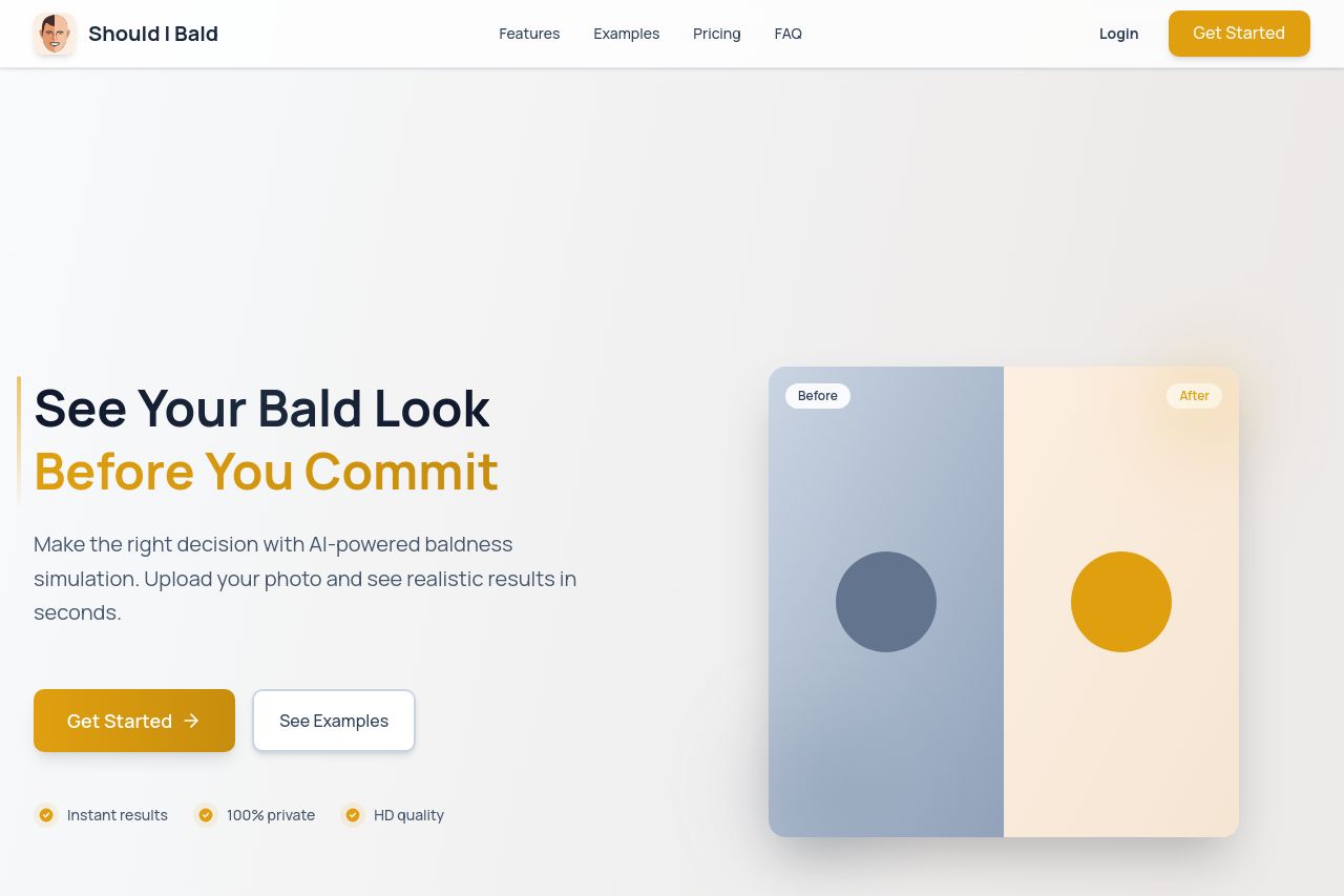
See what you'd look like bald before taking the plunge. Upload your photo and try different bald styles with AI-powered simulation.

Summary:
The landing page for Should I Bald has a simple concept backed by a solid value proposition, yet it stumbles in execution. Its design is markedly basic, with a bland color scheme that does not captivate the target audience. The typography is neither modern nor engaging, making large chunks of text visually monotonous. The CTA stands out, but its consistency and placement could be improved to really guide users efficiently. Social proof elements are missing, making it questionable for users whether it's credible. Without any contact details or company information, trust is further diminished. The page feels amateurish rather than professional, giving off the impression of a hastily thrown together project. The structure of the information is fair, albeit lacking logical flow and depth. Without an eye-catching design or reinforced credibility, the page falls flat, leaving a lot to be desired in both presentation and persuasion.
- Add social proof, including testimonials and recognizable partnerships or clients, to build trust.
- Enhance the color scheme and typography to create a more engaging and readable design.
- Provide company information and contact details to increase transparency and credibility.