yukutw.com
Landing Page Analysis
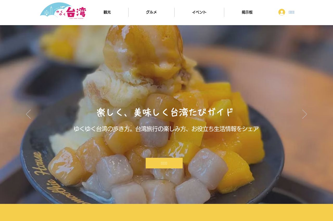
ゆくゆく台湾旅行・観光・生活ガイド! ガイドブックではなかなか見つからない、台湾最新情報やとっておき情報をシェア。旅・観光情報や生活ガイドまで、リアルな台湾の魅力をお届けします!
Summary:
The landing page has a cheerful aesthetic that aligns with its theme of exploring Taiwan. However, there are significant areas for improvement. The text readability is compromised by some encoding issues, making parts of the content unreadable. Visual consistency is interrupted by the frequent shifts in background colors and text elements, leading to a somewhat scattered appearance. The layout isn't optimized for a clean navigation flow, with sections that could be better structured to guide the user journey more effectively. While the imagery is enticing, the CTA placements are not prominent enough to stand out, potentially leading to lost conversion opportunities. The Open Graph elements are decent but lack a true visual punch to captivate and entice clicks.
- Fix encoding issues to ensure all text is readable.
- Improve CTA visibility with better contrast and placement.
- Unify background colors to enhance visual consistency.
- Streamline the layout for easier navigation.