amitgoyani.com
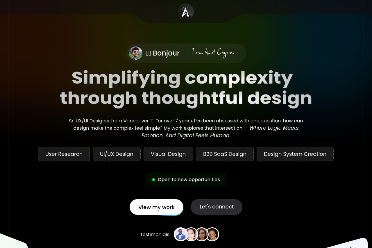
Landing Page Analysis
Hire Amit Goyani, a Vancouver UX/UI designer crafting web, mobile, and SaaS experiences that delight users and drive results.

Summary:
The landing page exhibits solid craftsmanship but blends into the background with its all-too-common design choice. The dark theme can work to highlight key text, but here it's too heavy, which makes everything blend. The hierarchy feels off; important text needs more contrast to stand out and grab attention. There's repetition, like the “What I do” section that doesn’t bring anything new the second time it appears. The value proposition is articulated but overly generic; it doesn't scream uniqueness or urgency. Credibility is well-established with testimonials, but it gets lost in the design clutter. Calls-to-action are there, but they lack punch and could be more enticing. Overall, while the foundation is solid, it feels like it’s trying to do too much and succeeds at none.
- Increase text contrast for readability against the dark background.
- Add more unique elements to the value proposition.
- Use CTAs that are more engaging and action-oriented.