lovable.dev
Landing Page Analysis
Lovable is your superhuman full stack engineer. Chat with AI to build web apps. Sync with GitHub. One-click deploy.
Summary:
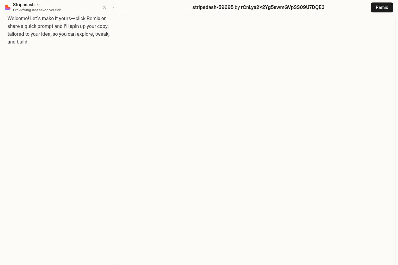
The landing page feels basic and lacks personality. The customization options are evident, but the overall design doesn't exude an innovative vibe. The hero section is bland. There is a simple section where users adjust metrics, but it lacks character and flair. Information is clear but fails to excite. The text is straightforward but lacks persuasive energy, especially where engagement is crucial. The design is a major downfall. While functional, it screams "template" without any unique flair. Use of color is lacking impact. Besides highlighting certain keywords, the color scheme doesn’t energize or engage the viewer.
Overall, the landing page suffers from a lack of creativity and engaging content. With a clear focus on options rather than persuasion, it misses out on convincing users why they need this service. There's a distinct lack of urgency, and the page does little to build credibility or convey professionalism.
- Revamp the hero section to be more inviting. Use dynamic, engaging headlines.
- Enhance visual design with a bolder color scheme to create more visual interest.
- Improve copy to better convey the unique benefits and features.
- Add testimonials or client logos for credibility.
- Implement a stronger visual hierarchy to draw attention to key features and actions.