pickuplineshub.com
Landing Page Analysis
Explore Pick up lines Hub for the best pick up lines to break the ice and start your conversation with confidence!

Summary:
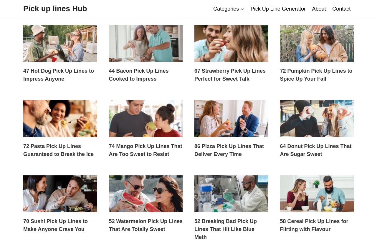
The page is a playful attempt at providing a variety of themed pick-up lines. The grid layout is straightforward, making it easy to browse through different categories. However, every section looks overwhelming due to a lack of variation in presentation. The site feels monotonous with repetitive layout and generic images.
Most headlines are trying way too hard with puns, which could detract from the actual content. There is also no visible call-to-action beyond browsing, and the footer includes generic social links without adding value.
Overall, the page lacks cohesiveness and misses opportunities to engage with the user through interactive elements or clearer calls to action.
- Add a prominent call-to-action to guide users.
- Introduce more visual variety in the layout, such as alternating image positions.
- Incorporate real testimonials or user-generated content to add credibility.