refliply.com
Landing Page Analysis
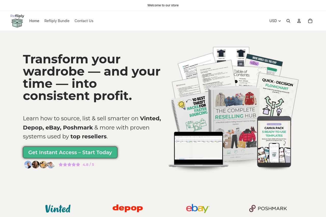
Start or scale your second-hand reselling business with Refliply. Get instant digital guides and toolkits to help you find, list, and sell profitable pre-loved fashion on Vinted, Depop, eBay, and Posh

Summary:
The website has a cohesive and professional design, with a strong focus on converting visitors into customers through clear calls-to-action and persuasive content. The color scheme is consistent and pleasing, although the CTA buttons could pop a bit more against the overall design.
The messaging effectively communicates the value proposition, particularly to those within the reselling community, by addressing their pain points and offering Refliply as a solution. Testimonials and social proof elements are well-presented and credible, enhancing trust.
However, the text-heavy sections could be more visually engaging, possibly by breaking it down with icons or infographics. The visual hierarchy could be tightened up to make important text stand out better. Overall, the structure allows for a solid reading flow, guiding users logically through the content.
- Make CTA buttons more visually distinct to increase conversion.
- Break down text-heavy sections with visuals or icons to aid engagement.
- Enhance visual hierarchy by optimizing font sizes and weights.