soulsync.tech
Landing Page Analysis
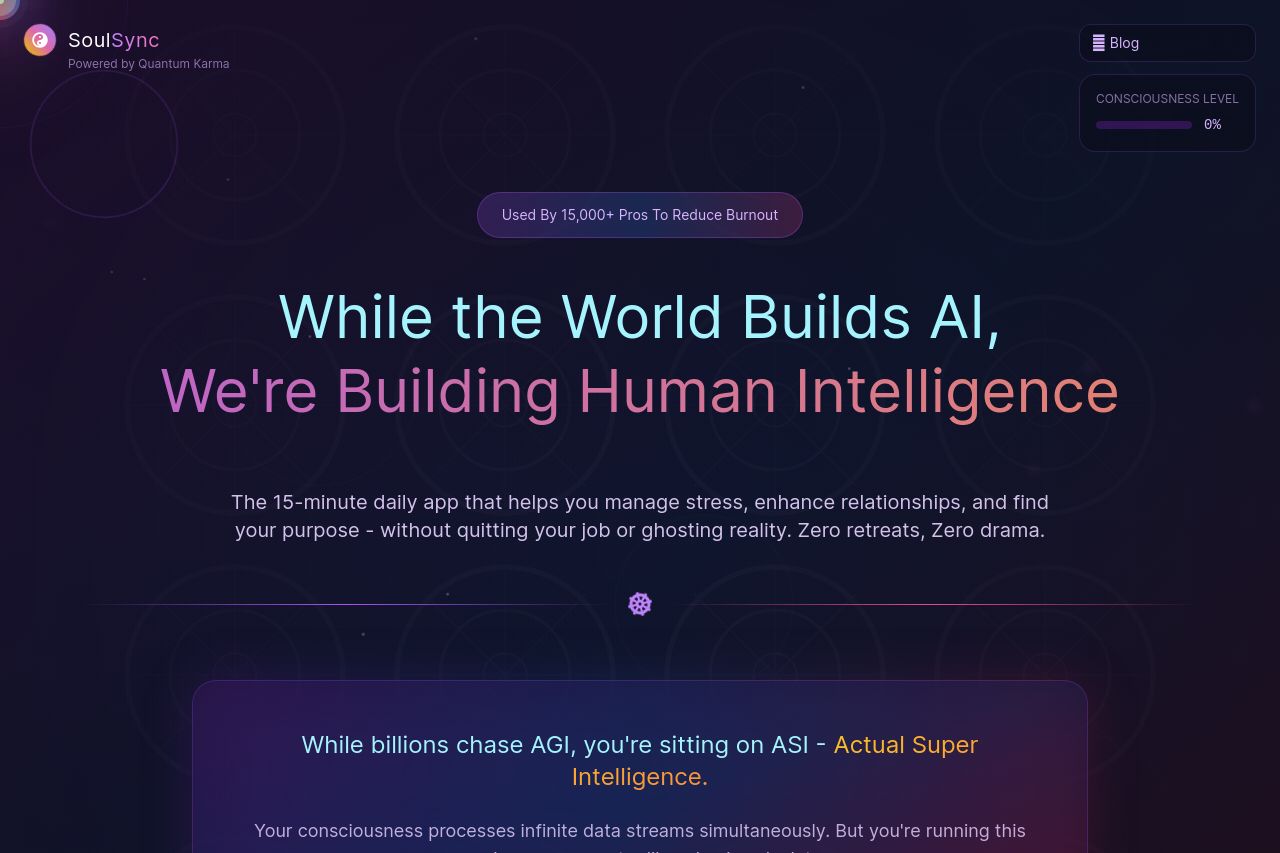
Stop juggling life's chaos. SoulSync combines ancient wisdom + AI to help young professionals master stress, relationships, career & parenting. Start your 7-day free trial.
64
Share on:
Summary:
60
Messaging
70
Readability
60
Structure
45
Actionability
80
Design
50
Credibility
The landing page is heavy on mystical, spiritual language, which adds a unique touch, but risks alienating those looking for straightforward information. The color scheme is cohesive, aligning well with a meditative, calming theme. However, the overall design is too centered on vague spiritual jargon without providing detailed, tangible benefits or features upfront. The single call-to-action, "Continue My Sacred Journey," might not resonate with those who expect precise action verbs that speak directly to what they're signing up for.
Main Recommendations:
- Simplify the language to reach a broader audience by defining specific benefits more clearly.
- Add more tangible examples or demonstrations of the features to better align with the target audience's practical needs.
- Improve the focus of the call-to-action by making it more specific and action-oriented beyond just a mystical reference.