majiripi.jp
Landing Page Analysis
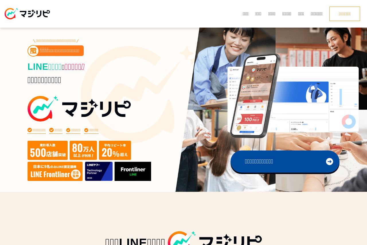
飲食店向けのLINE運用ツールの決定版!魔法のようにリピーターを集客!しかも、自動運用でかんたん手間いらず。
Summary:
The landing page has a vibrant, engaging aesthetic, but there are several areas requiring improvement. The messaging is somewhat clear, though more explicit definition of the target audience could strengthen its appeal. The readability suffers slightly due to dense text areas that aren't well-balanced with whitespace. The typography and color choices are generally good, though they lack the type of visual hierarchy that could make navigation easier. There’s a decent attempt at showing credibility through brand logos and client testimonials, but the call-to-action elements are not prominent enough, reducing their impact. Overall, while there are good foundational elements in place, the execution falls short, hindering its effectiveness.
- Enhance the visual hierarchy by using typography and color contrast to highlight key messages.
- Improve CTA placement and design to make them more prominent and actionable.
- Simplify blocks of text for better readability, breaking information into digestible pieces and using bullet points or subheadings.