epark.jp
Landing Page Analysis
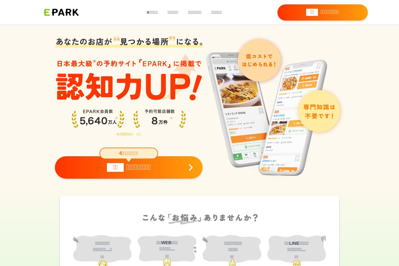
【集客にお悩みなら】EPARKに初期費用0円でお店の情報を掲載できるプランのご案内。HPの作成・SEO対策・公式LINEアカウントの周知など、お店の認知・集客に関するお悩みをサポートします!
Summary:
The landing page has a minimalist design with aesthetic green and orange color schemes. The visuals are engaging, with well-chosen icons and images that support the text. However, the messaging lacks clarity, especially since a significant portion of the text appears garbled or missing, which could confuse visitors. The page's structure is fairly well-balanced, with a logical flow of information, though some sections feel repetitive or unnecessary. Calls to action (CTAs) are visible and use contrasting colors, but they could be more action-oriented to drive user engagement effectively. Readability suffers due to the missing text, making it hard to evaluate the language tone or sophistication accurately. Credibility indicators such as client logos or testimonials appear absent, which could affect trustworthiness.
- Fix any garbled or missing text to ensure clarity in messaging.
- Enhance credibility by adding testimonials or client logos.
- Make CTAs more actionable and engaging by using clear, directive language.