myalche.com
Landing Page Analysis
Discover herbal wellness products designed for daily wellness. Shop natural remedies and holistic health essentials to support balance and vitality.
Summary:
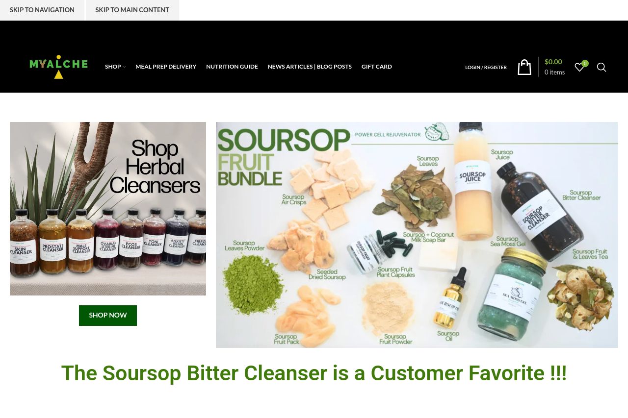
The landing page is visually engaging with a certain vibrancy that matches the wellness theme. However, it's not all sunshine and herbs here. The value proposition is somewhat buried, making it confusing as to what you should be looking at or focusing on first. Messaging doesn't clearly define the unique selling points, which can muddle the user journey. The design lacks consistency in hierarchy, with too many bold elements fighting for attention simultaneously. The readability suffers with some text blocks appearing crowded, lacking the whitespace needed for clarity. Despite these issues, the product images are well-done and showcase a wide range of offerings, creating visual interest. But you'll need to dig through a crowd of products to find what you're looking for, making navigation and overall flow clunky and confusing.
- Clarify the main value proposition prominently on the page.
- Improve visual hierarchy and reduce clutter for clearer navigation.
- Enhance product descriptions for better audience alignment.