clickrs.de
Landing Page Analysis
🎃 EARLY HALLOWEEN SALE: Bis zu 70% Rabatt 🎃
Summary:
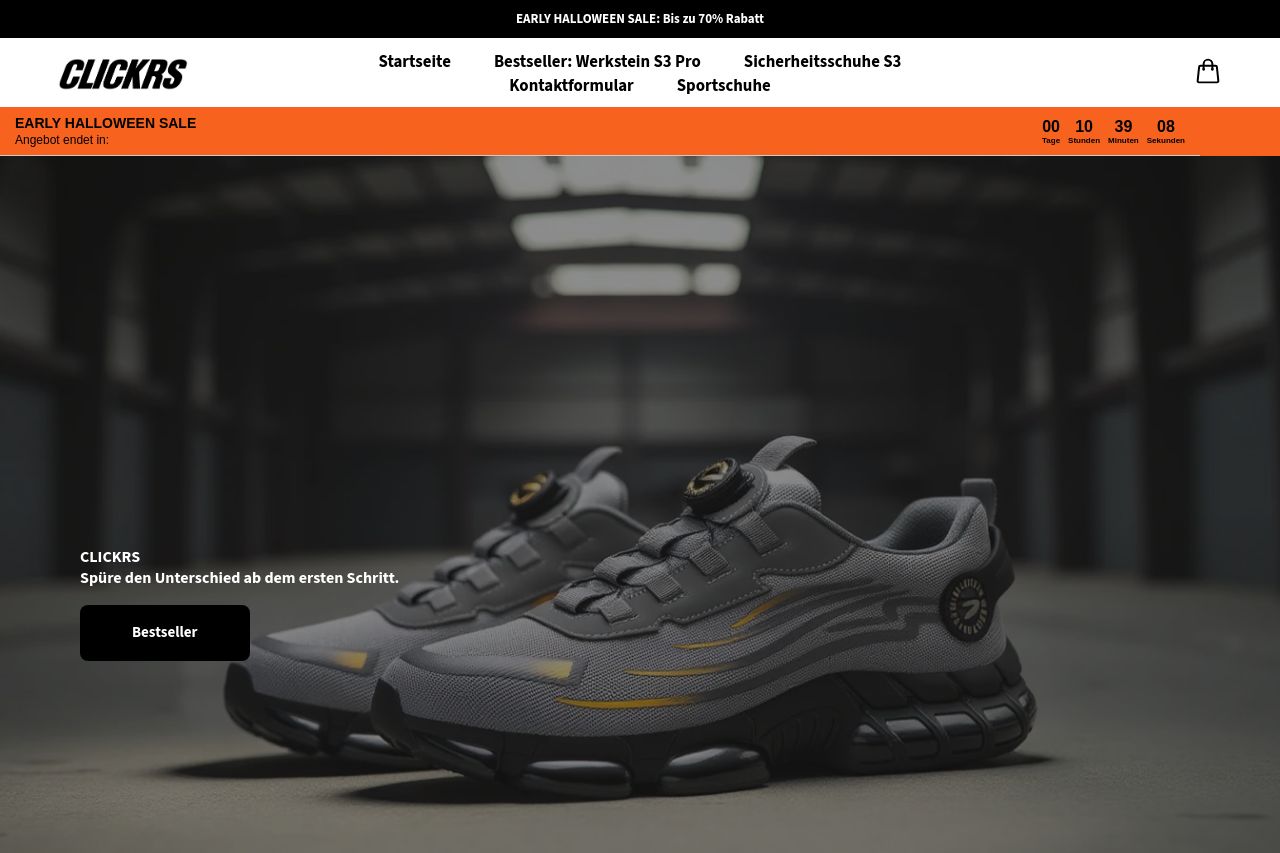
The landing page attempts to communicate Clickrs as an established brand for safety shoes but fumbles on execution. The hero section is visually striking, showcasing a sleek, modern shoe with a decent background. However, the text lacks a strong value proposition, only suggesting users "Feel the difference from the first step." A stronger, more specific hook could have pulled in more interest.
The Bestelling Produkte section displays products effectively with clear prices and discounts but lacks compelling descriptions that highlight unique selling points beyond just materials and general safety. Without distinct details, these product listings might not differentiate sufficiently from competitors.
Design consistency is strong, using a uniform style across the font and layout. But color usage feels bland; there’s a lack of contrast that makes elements blend together instead of highlighting importance.
On credibility, the testimonial nod at the top helps, but the site lacks badges, partner logos, or any distinctive proof of reliability. Social proof is weak, making the brand feel a bit isolated.
In actionability, CTAs like "Besteller" stand out but feel generic and uninspired without a clear call to action tied to a product or benefit.
Once you get to "Über Clickrs," the text is verbose and buried under a swarm of images, losing user interest quickly. Keeping it concise and impactful would improve readability and engagement.
- Revise the value proposition to be more captivating and precise about the product benefits.
- Enhance product descriptions with key differentiators to stand out from competitors.
- Improve CTA text to be more dynamic and specific, offering clear incentives.