oissite.com
Landing Page Analysis
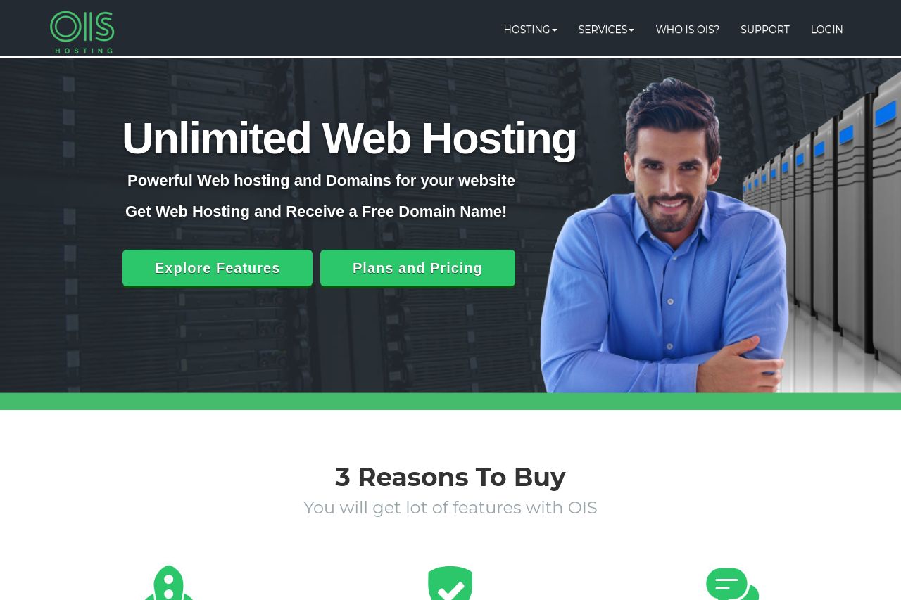
OIS Home - Inside see our Unlimited Web Hosting - Powerful Web Hosting and Domains for your website. Get Web Hosting and receive a free Domain Name!

Summary:
The landing page for OIS web hosting attempts to capitalize on a clean and professional design, but it falls flat in several aspects. The hero section's bold promise of "Unlimited Web Hosting" is straightforward but lacks distinctive personality or unique selling propositions to draw potential customers in. The call to actions are visible, yet lack urgency or differentiation. The "3 Reasons to Buy" section, while enumerating benefits, uses generic icons and a bland presentation. The compare plans section is informative but mimics a typical pricing grid with nothing noteworthy to set it apart from countless others. The domain search section is utilitarian without a strong visual hook or incentive to entice users to engage. Overall, the content is serviceable but unexciting, and could fail to engage or convert potential leads. There's a clear structure but with lack of creativity or emotional appeal, causing the site to feel almost promotional rather than persuasive.
- Enhance the value proposition in the hero section to make it more unique and engaging.
- Use more vibrant and attention-grabbing call-to-action colors to increase visibility and interest.
- Highlight real customer testimonials to boost credibility and connection with the audience.