ozzyremovals.au
Landing Page Analysis
Cheap, reliable Perth removalists offering house, furniture, and office moving services. Two men and a truck from just $90/hr! Get your free quote today.
Summary:
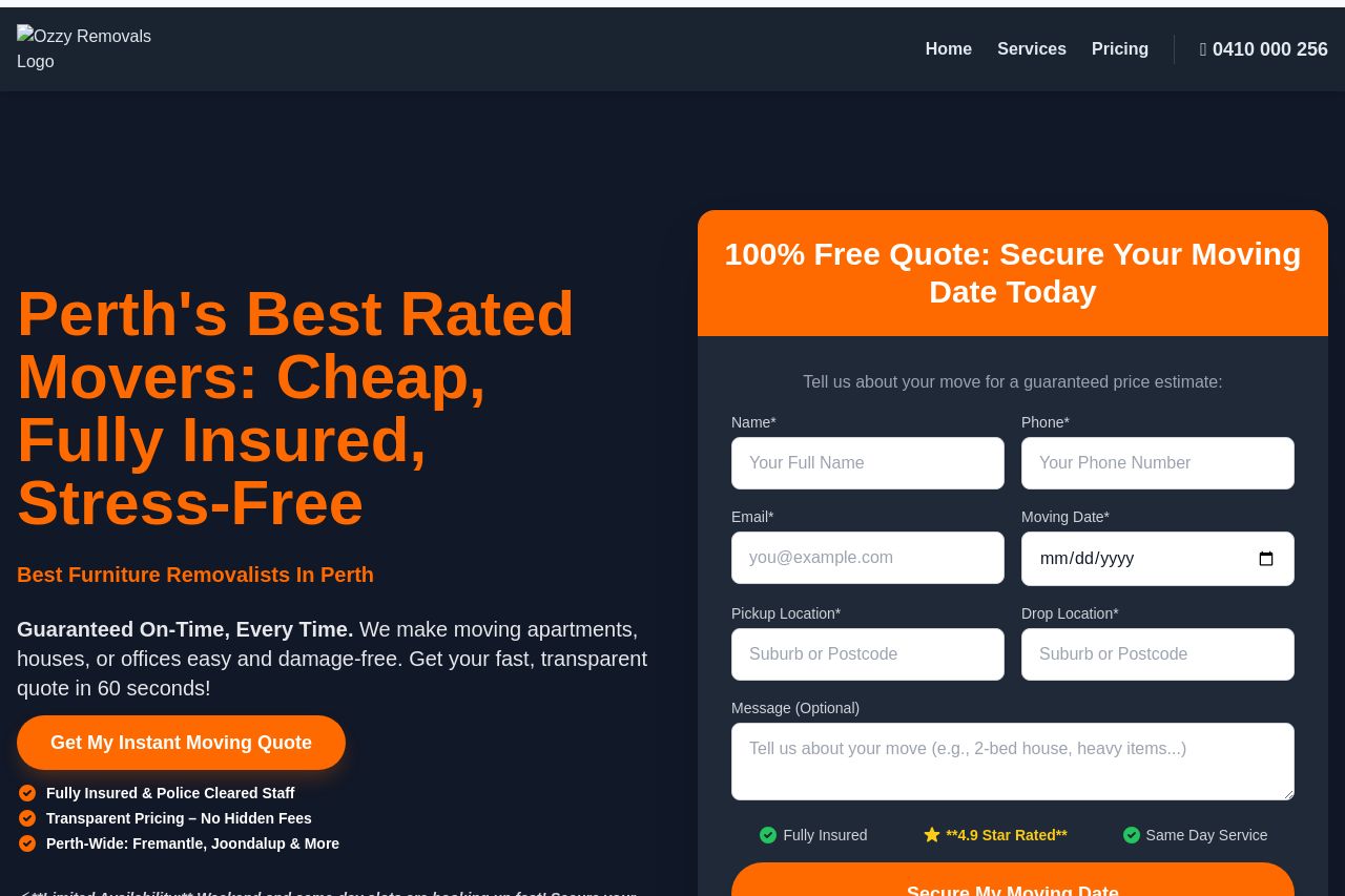
The website for Ozzy Removals is visually bold with a strong emphasis on an orange and dark color scheme that succeeds in drawing attention to important call-to-action buttons. However, the use of space and the overall design can feel cluttered and confusing at times. Messaging is clear, stressing benefits like insurance and stress-free service, but the tone can be a bit overzealous, with phrases like "Best Furniture Removalists in Perth" appearing a bit over the top. Readability suffers due to long sentences and the overuse of bold text, making the content feel more cluttered. Several sections have redundant information, and CTAs vary in text, leading to potential buyer confusion. Credibility is bolstered by testimonials and clear pricing, but imagery could be more varied to boost professional impression.
- Simplify the text by breaking long paragraphs into shorter, punchy sentences.
- Reduce redundancy in CTAs to maintain focus on primary actions.
- Improve visual hierarchy by using more consistent heading sizes and colors.