oenai.one
Landing Page Analysis
نقدم شروحات وأخبار ومراجعات لأحدث أدوات وتقنيات الـ AI لمساعدتك على فهم المستقبل.
64

Share on:
Summary:
50
Messaging
65
Readability
60
Structure
55
Actionability
55
Design
80
Credibility
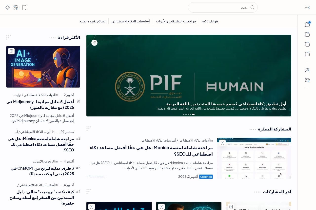
OenAi Tech's landing page offers a generally neat layout with a focused topic on AI tools and technologies, which is fantastic for a niche audience. The color scheme is consistent and easy on the eyes. However, the page could benefit from better visual hierarchy and organization. The headlines are a bit cramped, and the mix of text and images lacks strong differentiation, which makes the content difficult to scan. Additionally, the CTAs could be more prominent to drive action effectively. Social proof is also barely present, which could inhibit trust for first-time visitors.
Main Recommendations:
- Enhance visual hierarchy by using varied font sizes and weights to differentiate sections.
- Include more prominent CTAs to guide user action clearly.
- Incorporate social proof elements like testimonials or client logos to build trust.