co.uk
Landing Page Analysis
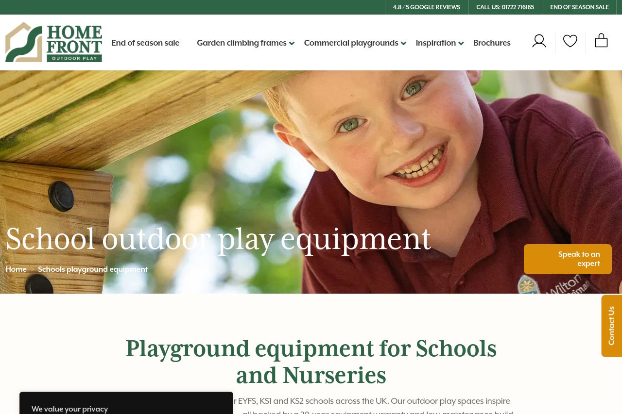
Playground equipment for Schools and NurseriesWe create outdoor play area's for EYFS, KS1 and KS2 schools across the UK. Our outdoor play spaces inspire le
Summary:
The landing page for Home Front Outdoor Play has a clean and child-friendly appeal but falls short in a few critical areas.
The value proposition is clear for anyone in education searching for playground solutions, and the audience is well-defined. However, the consistency in tone and engagement with the user can be improved.
Readability suffers because of the intrusive cookie notice that disrupts flow across multiple sections, creating a jarring experience. The typography and color scheme generally are cohesive, but the hierarchy could be better emphasized to guide the user more effectively through the content.
Design-wise, the page utilizes a pleasant color palette, but the overuse of distracting banner CTAs hinders actionability. The structure displays good logic, but the placement of Call to Action elements could be more deliberate to align with user intent and journey progression.
Overall, while professionalism and credibility elements exist, clarity and a more focused user experience would elevate the effectiveness of the landing page.
- Remove or minimize the cookie notice to improve readability and user experience.
- Enhance the prominence and clarity of CTAs to better guide user actions.
- Improve typography hierarchy to make key messages stand out more clearly.