fitbylevelup.com
Landing Page Analysis
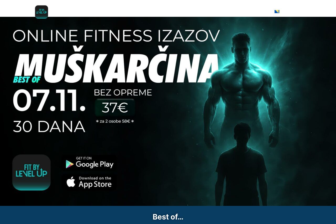
Best of…
Summary:
The landing page does a reasonably good job in presenting an intense and motivational theme, which should resonate well with the target audience of men interested in online training. The use of dark colors and strong imagery aligns with the theme, making it visually engaging to some extent. However, there are many areas needing improvement.
The messaging lacks clarity and could do with a more defined value proposition. While urgency is well portrayed with countdown timers, the CTA buttons are not as prominent as they could be, often blending in with the rest of the page. The inconsistent use of fonts and colors can be distracting, as can the dense blocks of text.
Consistency is another issue, with some sections feeling disconnected in terms of layout and style. While testimonials are included, their presentation lacks depth and fails to convincingly sell the product. Transparency and professionalism are adequate but not exemplary. Overall, while the page has potential, it currently falls short in effectively converting visitors into customers.
- Enhance the value proposition by clearly stating unique benefits from the start.
- Improve font consistency, ensuring headings and important points stand out.
- Make CTAs more prominent by using contrasting colors and strategic placement.