wrteam.in
Landing Page Analysis
Manage multi branch schools, students, and classrooms with WRTeam’s eSchool SaaS. A complete ERP and online classroom management system software for institutes with Flutter app script and Laravel webs

Summary:
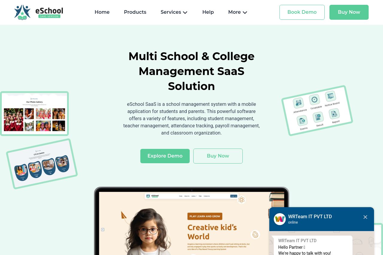
The landing page for eSchool SaaS manages to cover a wide array of features and information, but in doing so, it sacrifices clarity and focus. The hero section provides a fairly clear value proposition, emphasizing the product's use for multi-school management, but the design is cluttered and doesn't guide the eye as well as it should. The messaging struggles with audience alignment, as it seems too broad, trying to please everyone from tech-savvy admins to novices." The text's tone is fairly professional but tends to become generic, failing to make a memorable connection. Readability is hindered by lots of text blocks that lack formatting, while the color scheme sticks to safe choices that don't visually impress. Structure is a bit of a mess—long, scrolling page with dense text and unnecessarily heavy information dumping. The calls-to-action (CTA) are numerous but not well-targeted, lacking any sense of urgency or why a visitor should act now. Credibility indicators are decent with testimonials, but visual clutter and inconsistent design detract from the page's professional look.
- Simplify the hero section by removing excess imagery and focusing on a key CTA.
- Streamline the text blocks with bullet points and sub-headings for better readability.
- Enhance CTA buttons to stand out more, using contrasting colors or larger fonts.
- Refine audience targeting in messaging for clear, specific value rather than broad statements.
- Reduce the visual clutter by removing repetitive elements and focusing on key features.