homeguru.com
Landing Page Analysis
Call Us:
71
Share on:
Summary:
65
Messaging
60
Readability
70
Structure
55
Actionability
65
Design
90
Credibility
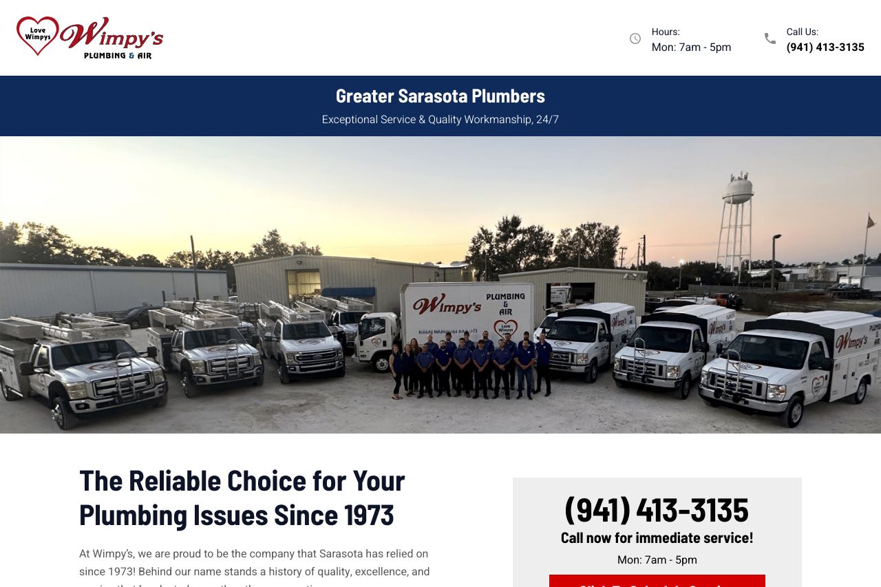
Overall, the page is straightforward and professional, but there's room for improvement. The headline highlights experience and reliability, which is great, but the design lacks flair and excitement. The color scheme feels basic and doesn't help the CTA pop as much as it should. On the upside, services are clearly listed and there's good social proof through testimonials. However, the copy can get long-winded and could benefit from some trimming and focus on the benefits rather than just service history.
Main Recommendations:
- Make the CTA more visually appealing to really draw attention.
- Simplify and focus the text to highlight benefits instead of just history.
- Enhance the color scheme to add more excitement and clarity.