freefrom.cloud
Landing Page Analysis
Expert DevOps consulting to migrate your infrastructure from AWS, Azure, GCP to cost-effective on-premise solutions. Save 40-70% on cloud costs with zero downtime. 15+ years experience.

Summary:
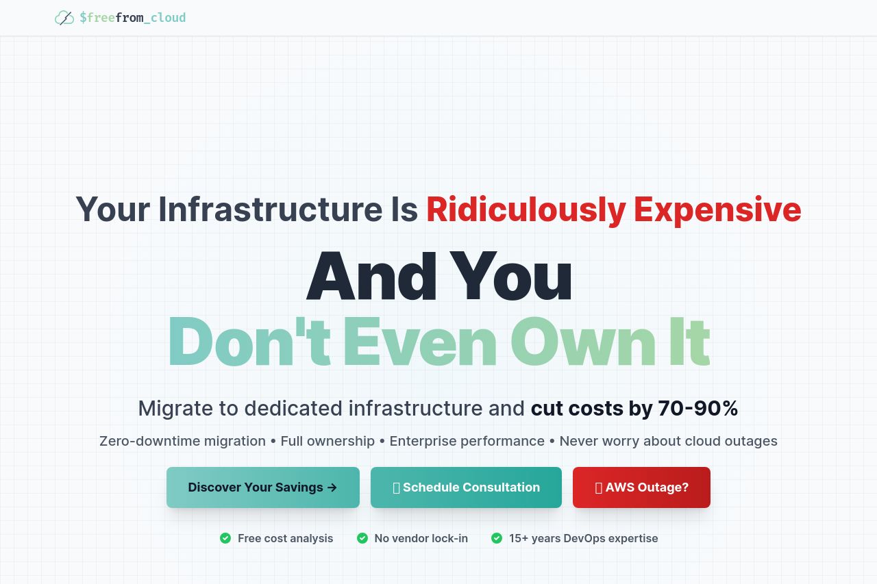
The landing page for $freefrom_cloud is quite effective in communicating its value proposition with bold typographical choices and succinct messaging. The use of contrasting colors for emphasis, like red for urgency and green for positive outcomes, is smart. However, the visual hierarchy in some sections could be better managed to avoid clutter and enhance readability. The "Real Companies, Real Savings" section utilizes actual case studies effectively, lending credibility. The overall tone is straightforward, targeting business professionals who are fed up with high cloud infrastructure costs. The design maintains consistency, but the layout occasionally feels too dense. Call-to-Action (CTA) buttons are clear but could be more strategically placed for optimal user engagement. Testimonials are well-placed for credibility, although integrating more visual elements could enrich the presentation. Overall, it does a fine job but there's certainly room for polish, especially in simplifying sections and enhancing visual balance.
- Improve the visual hierarchy to avoid clutter in dense sections.
- Enhance the CTA placement for better visibility and engagement.
- Incorporate more visual elements to break up text-heavy sections.