vercel.app
Landing Page Analysis
Sign Up
57
Generated on:
October 27, 2025Score:
57/100Audience:
art gallery visitorsShare on:
Summary:
40
Messaging
65
Readability
60
Structure
60
Actionability
50
Design
50
Credibility
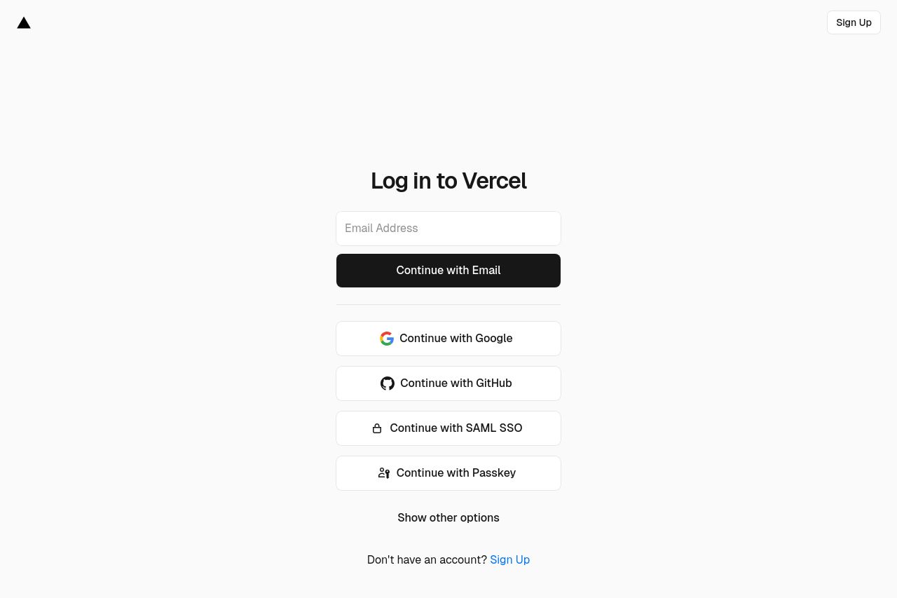
The login page for Vercel is clean and minimalist but borders on too minimalistic to be effective. The "Log in to Vercel" prompt is clear, and there's a seamless integration for multiple login options such as Google, GitHub, SAML SSO, and Passkey. However, the lack of visual hierarchy makes it hard for any particular option to stand out. The white space is excessive, leading to a sense of emptiness rather than focus. The sign-up option is understated and could easily be missed. In essence, it’s functional but uninspired.
Main Recommendations:
- Add more vivid color or contrast to the CTA buttons to make them more noticeable.
- Include a brief description or benefits of logging in with Vercel to enhance engagement.
- Reorganize text and elements to make better use of white space and guide the user more effectively.