oversee.biz
Landing Page Analysis
Maximize air and hotel savings with smart automation and AI powered precision.
Summary:
Overall, the landing page does a fairly decent job of presenting the main points and core benefits of the product.
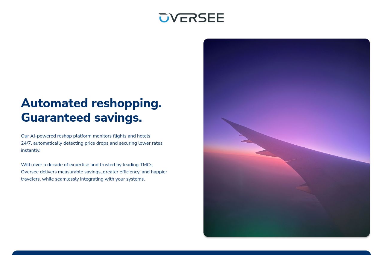
Messaging: The main value is communicated clearly with terms like "Automated reshopping" and "Guaranteed savings." The tone is professional, matching the business-focused audience.
Readability: The content uses straightforward language but suffers in readability due to the dense amount of form fields which can overwhelm the user.
Design: The design is somewhat consistent with a limited color palette, but it fails in creating a strong visual hierarchy. The placement of the form right after the hero section feels intrusive.
Structure: Each section logically follows the next, but there is an overload of form fields in the demo section, which disrupts user flow.
Actionability: CTAs are clear and action-oriented but somewhat lost amongst the clutter of text in the form.
Credibility: The page highlights trust with indicators like expertise and trusted TMCs, but lacks customer testimonials and visual trust elements like logos or badges.
- Reduce the number of form fields to make it less intimidating and easier to complete.
- Add customer testimonials or reviews to enhance credibility.
- Reorganize the CTA placement for better visibility and prominence.