shophighnoonhouse.com
Landing Page Analysis
Discover premium hemp-derived gummies, herbal teas, CBG at High Noon House. Natural wellness products - elevate with organic herbs
Summary:
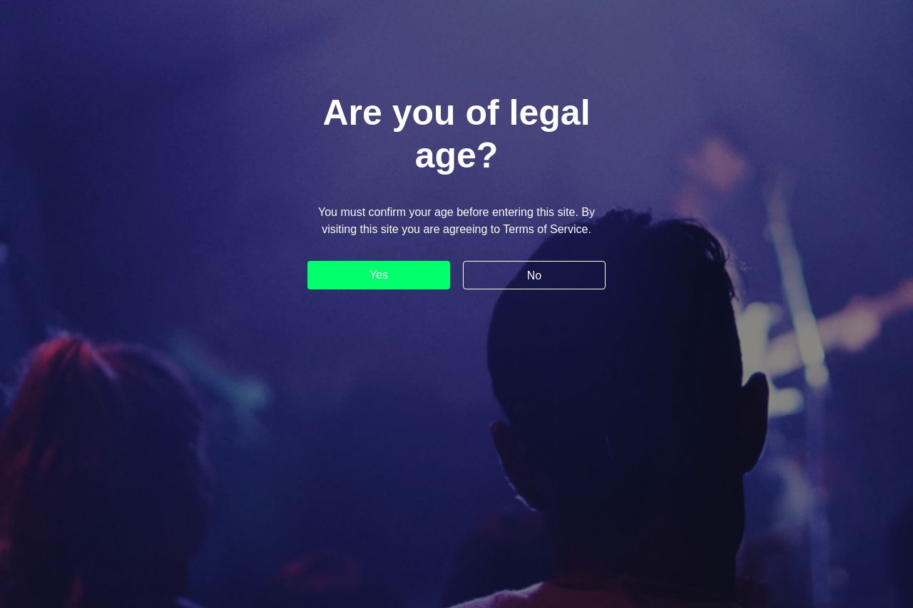
The landing page kicks off with a strong gatekeeper: an age verification screen. The background is a blurred, mysterious concert setting that might connect with a younger, edgier crowd. Unfortunately, the interaction here is pretty flat and generic, with no effort to immediately convey the brand's unique value. The value proposition takes too long to become visible on the site.
Visually, the colors are muted but effective in maintaining focus on the call-to-action, "Yes," which stands out effectively in bright green. However, there is a missed opportunity to clearly connect the imagery with the brand ethos right from the get-go.
The messaging needs more work in terms of clarity and alignment with audience expectations. The tagline mentions the product's nature-oriented benefits, yet it lacks depth or a compelling hook to make you want to dive deeper.
Open Graph data here is a bit of a verbose mess. It conveys the necessary information but strays into the realm of over-explanation. The image used for Open Graph could be more engaging, though it aligns with the brand's friendly and playful side.
- Make the value proposition evident from the first page to capture interest immediately.
- Enhance the age verification page with brand-aligned visuals and messaging that gives a sneak peek into what makes your products special.
- Simplify and focus your Open Graph title and description to make the message punchier.