aha-tokyo.com
Landing Page Analysis
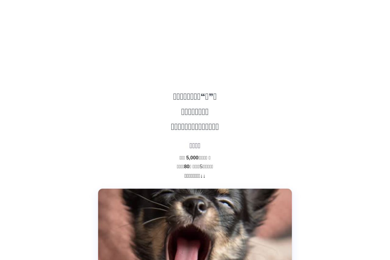
歌広告オンラインワークショップ|AHA TOKYO 商品・サービスを“歌”で届ける画期的手法広告の常識を変える「歌広告」 【...

Summary:
This landing page is all over the place. The visual hierarchy is confusing with mixed font sizes and an inconsistent use of colors that make the page seem unorganized. The Call To Action (CTA) is unclear and lacks prominence. The images and icons used don't necessarily support the text in a meaningful way, or even relate to the product effectively.
The text seems disjointed, mostly because of its scattered presentation and lack of flow. There isn't much whitespace to give breathing room to elements either. The value proposition, if any, is buried or not clearly communicated.
Credibility efforts fall short because there are no explicit trust indicators like testimonials or customer logos visible. The page lacks a structured layout, leading to a disorganized feeling and a lack of narrative. Overall, there's a dire need for clearer messaging and a focused design strategy.
- Rework visual hierarchy to make information clear and logical.
- Create a clear and compelling CTA that stands out.
- Introduce consistent colors and font sizes to provide uniformity.