maxwellsocial.com
Landing Page Analysis
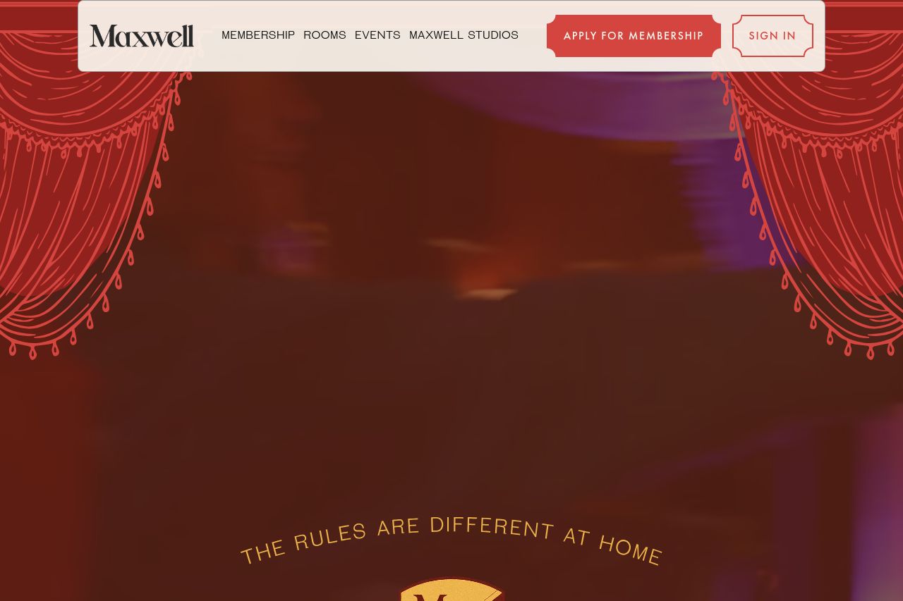
isn't a private club, it's a group of friends building a community together. In the heart of New York, we've built a home to make friends, break bread, and grow as we move through life together.
Summary:
Maxwell's website has a distinct charm and warmth, almost like stepping into an old-world social club. The aesthetic resonates with a vintage theme, evident through the choices of colors and typography. There's a heavily community-focused message, pushing the idea of belonging and friendships. Unfortunately, key information is buried. Descriptions about the spaces or membership benefits aren't in-your-face visible, which should be a priority. The call-to-action buttons are often not distinct enough, losing emphasis in the sea of maroon and cream. Visual hierarchy is pretty mediocre. Sections blend into each other with too much sameness, and the consistent use of similar fonts and colors doesn't help guide the eye effectively. Social proof is included, like the testimonial from Emma, but it's not strong enough to be convincing. Overall, while the allure of community is clear, the website lacks more structured, effective information delivery and a sense of urgency in its CTAs.
- Enhance visual hierarchy by using diverse font sizes and weights for better readability.
- Make CTAs more prominent with contrasting colors and action-oriented text.
- Improve the structure by grouping similar content for clearer navigation.