x20.io
Landing Page Analysis
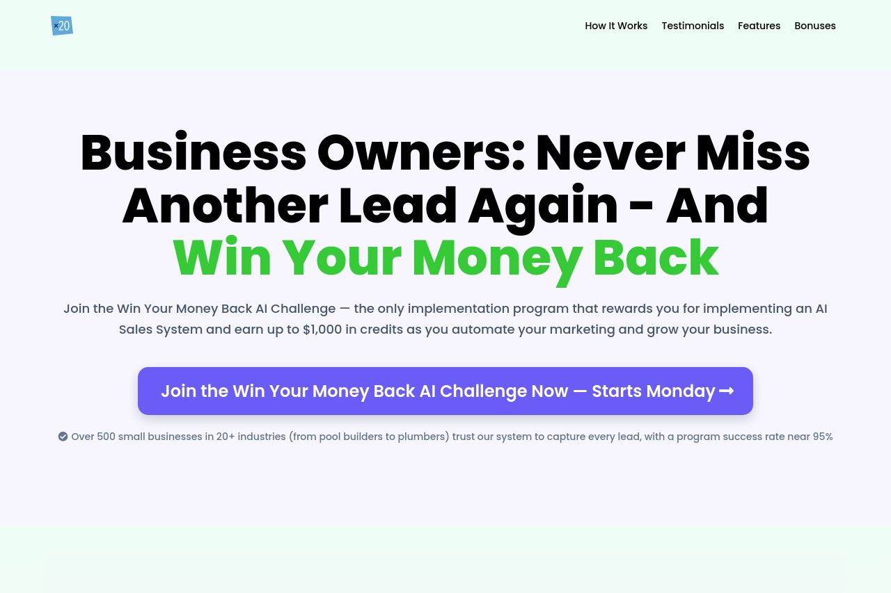
AI Win-Back Challenge Landing page
Summary:
The landing page effectively targets business owners looking to automate lead generation but struggles with several inconsistencies and clarity issues. While the headline is strong and clearly speaks to business owners, certain sections feel overly dense and repetitive. The logical flow and content structure are decent, but some headings don’t draw enough attention. The design uses contrast well, especially with green and black text, but some CTAs get lost due to lack of emphasis. The testimonials add credibility, but the layout feels overwhelming with too much text to digest. Urgency from countdowns and limited spots is a good touch, but some messaging lacks the punch to convert. Overall, it's a solid attempt but falls short in polishing execution.
- Increase the prominence and clarity of CTAs to boost conversion.
- Simplify sections; reduce text density for better readability.
- Align headings more clearly with their respective sections to ensure flow.