goadstra.com
Landing Page Analysis
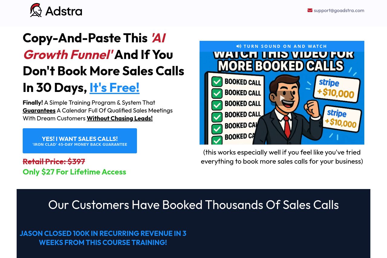
Adstra's new program where they are unveiling everything they do for clients to unlock massive growth and book 100+ meetings for clients monthly.
Summary:
This landing page is packed with information and testimonials but feels excessively cluttered. The initial value proposition is somewhat clear, offering a bold promise of increased sales through the 'AI Growth Funnel'. However, the overuse of testimonials makes it feel overwhelming rather than persuasive. The visuals don't support the core message strongly; instead, they contribute to a frenzied look. The tone is aggressive, which might be off-putting to some business owners despite being attention-grabbing. On the plus side, they emphasize risk-free purchasing with a money-back guarantee, appealing to cautious buyers. UI elements like the call-to-action are visible but clash with surrounding text.
- Simplify the layout by reducing the number of testimonials or creating a separate page for them.
- Use consistent visual hierarchy to guide the viewer's attention effectively.
- Refine the tone of messaging to sound less aggressive and more professional.