getbaddies.com
Landing Page Analysis
Ein von MIT trainiertes KI-System analysiert 50.000+ erfolgreiche Profile und erstellt dein perfektes Dating-Profil. Wissenschaftlich belegt: bis zu 847% mehr Matches. Individuelles Profil in 60 Sekun
Summary:
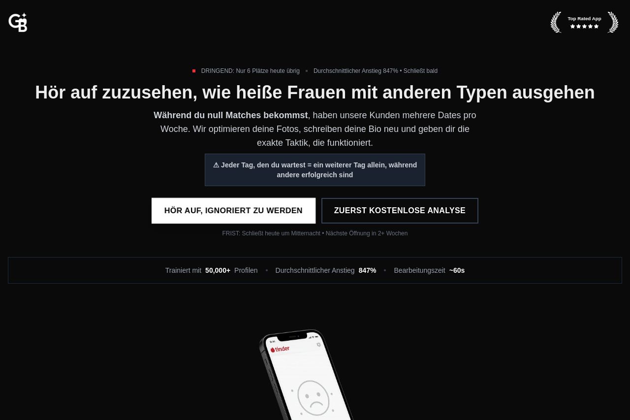
The landing page certainly makes bold promises, focusing heavily on urgency and scarcity to drive conversions. The main headline "Hör auf zuzusehen, wie heiße Frauen mit anderen Typen ausgehen" is attention-grabbing but might feel aggressive or even off-putting for some users. The use of fear-based tactics throughout, such as warning about wasting time and being ignored, could be effective for motivating the target audience but might alienate others.
The design is dark and uses urgency signals like "DRINGEND" and limited availability notices to create pressure. The testimonials with specific details and results add credibility. However, the page feels overly cluttered with text blocks in various weights and styles, which hinders readability.
The CTA buttons stand out but feel a bit pushy with phrases like "STOPPEN ZU WERDEN". While the CTAs are relevant, the extreme scarcity tactics might come across as insincere if not validated by actual limited spots. Social proof is strong with recognizable Tinder logos and direct client testimonials, giving a trustworthy vibe.
Overall, the page is a mix of effective tactics and slight overkill on urgency that could be refined for better balance and improved user trust.
- Soften the aggressive tone to avoid alienating potential customers.
- Reduce the clutter and improve the visual hierarchy for easier readability.
- Add more real-world examples or visuals to illustrate the service's effectiveness.