co.il
Landing Page Analysis
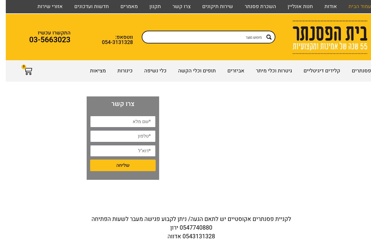
בית הפסנתר - קניית פסנתרים חדשים ויד 2, פסנתרים חשמליים, פסנתר כנף, פסנתרי קיר ועוד... חנות כלי נגינה אונליין עם ניסיון של למעלה מ 55 שנה.
Summary:
בית הפסנתר has a strong brand presence with its long-standing history, but the website struggles with clarity and cohesion. The value proposition isn't instantly clear, and the text is somewhat overwhelming without sufficient breaks or engaging elements. The visual design lacks hierarchy, making important information and CTAs blend into the background. Consistent colors do enhance credibility, yet the overall design feels outdated and doesn't utilize modern web design elements effectively. Social proof is present, but it's not compelling or visually highlighted. Readability is marred by dense blocks of text with low engagement factor. Overall, the website has solid foundational elements that are poorly executed. It needs improved readability, snappier copy, and better visual hierarchy to properly leverage its established credibility and market position.**
- Clarify the main value proposition right at the top to engage visitors immediately.
- Improve the visual hierarchy with clear sections, varied fonts, and emphasis on key points.
- Break up long paragraphs and use more engaging, concise copy.
- Enhance CTA design and placement to make them more noticeable and action-oriented.
- Utilize modern design elements to refresh the overall look and feel.