refliply.com
Landing Page Analysis
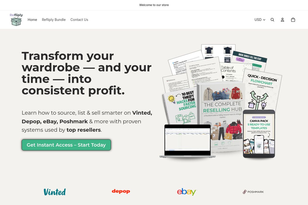
Start or scale your second-hand reselling business with Refliply. Get instant digital guides and toolkits to help you find, list, and sell profitable pre-loved fashion on Vinted, Depop, eBay, and Posh
Summary:
The landing page is well-structured, providing clear information and an easy flow that leads the user through the reseller journey. However, some areas could be improved. The visual hierarchy is solid, but it could benefit from a bit more contrast in some text sections to improve readability. The messaging is clear, but it could be even more directly targeted to address specific pain points of potential customers. It effectively communicates the value proposition and benefits, but more emphasis on urgency might enhance CTAs. The design is generally consistent, but some sections could use more diversity in design elements to keep things engaging throughout the scroll. Social proof is robust, with testimonials and trust logos enhancing credibility.
- Increase text contrast in areas with more narrative to enhance readability.
- Emphasize urgency in CTAs to encourage quicker user action.
- Introduce more design variations within different sections to maintain user engagement.