loneslice.com
Landing Page Analysis
Shop Now
Summary:
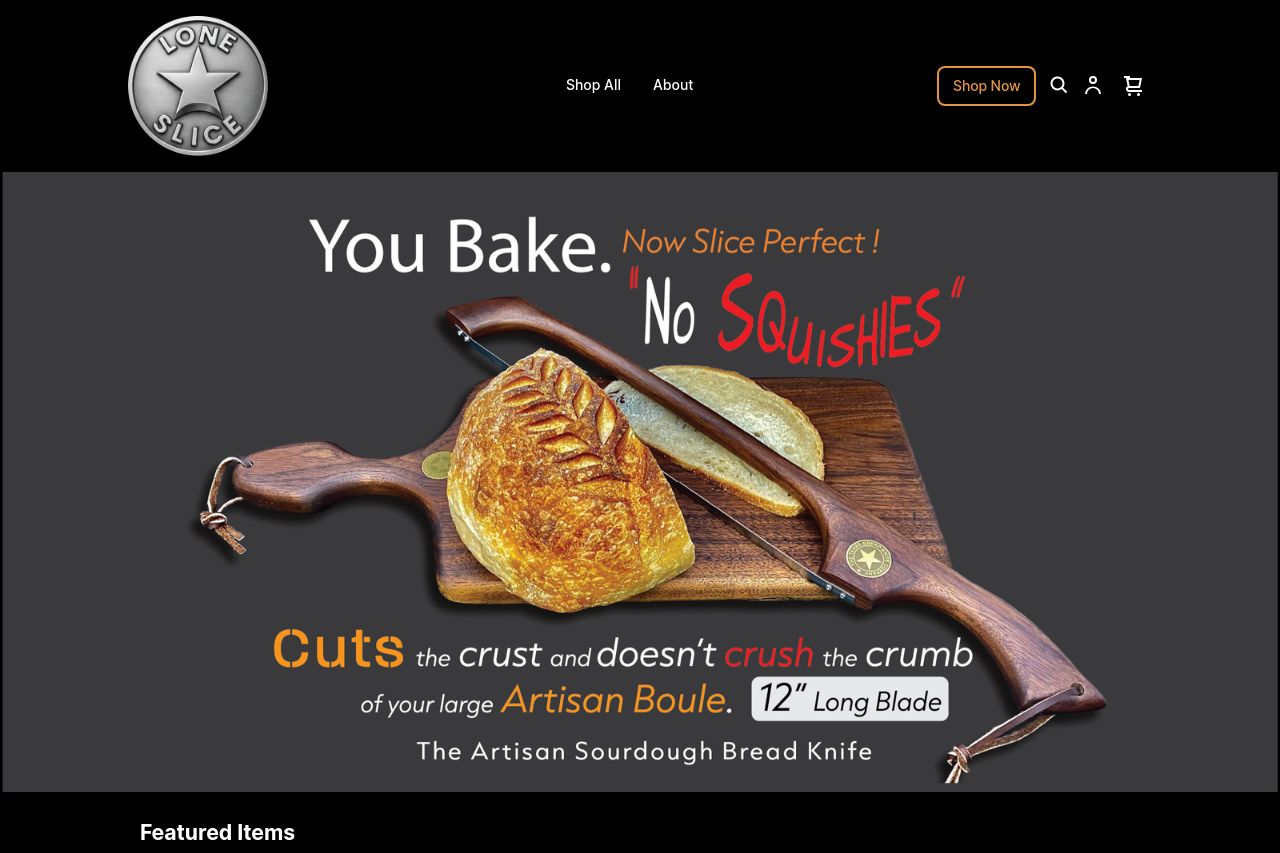
The website overall presents a distinct and strong theme centered around sourdough bread and slicing. The use of contrasting typography and visuals like the artisan knife and bread does capture attention, but at the same time, the visual style seems a bit chaotic. Some text elements, especially the tagline "No Squishies," feel informal in a way that could undermine the premium feeling that the design tries to portray. The message could be clearer and more refined.
The site design really captures the essence of a specialized product, though the layout could be more organized. There is adequate use of images to showcase the product, but the sections could be structured better for a more fluid reading experience. However, parts of the site feel disjointed, especially the random appearance of the text without leading into a CTA clearly.
In terms of credibility, the site misses basic elements like trust badges or customer testimonials that could significantly establish trust among new visitors. The design attempts to convey professionalism, but could delve more into professionalism with a touch of consistency across elements.
- Polish the value proposition so it's more easily understood.
- Enhance the visual hierarchy through consistent typography and layout.
- Include trust elements like testimonials or reviews for credibility.