loneslice.com
Landing Page Analysis
Shop Now
Summary:
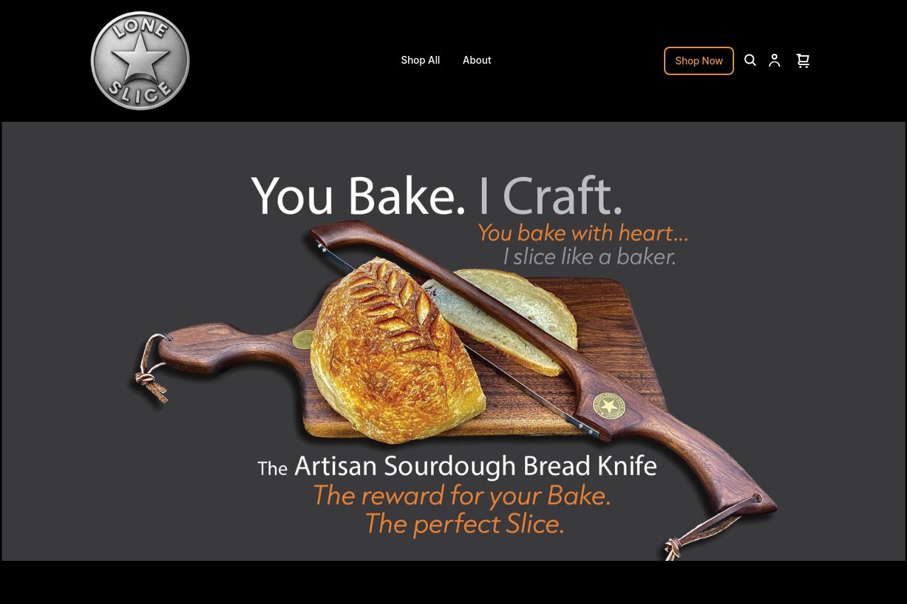
The landing page for LoneSlice offers a visually appealing presentation of the Artisan Sourdough Bread Knife, but several areas need refinement for better engagement and clarity.
The design is pleasing with a cohesive color palette that resonates well with the artisan theme, but it lacks a clear hierarchy in some sections, making it challenging to quickly absorb key information. The messaging attempts to connect emotionally with bakers but falls short by not clearly defining the main value proposition early in the user journey. Some CTAs are strong but often blend into the surrounding content, reducing their effectiveness. Social proof is missing, which can harm credibility, especially for new customers. Additionally, the sections could benefit from better alignment and spacing to improve readability. Overall, it's a solid effort but needs tightening to maximize impact and conversion.
- Make the main value proposition clearer in the hero section, emphasizing what sets the knife apart.
- Increase the prominence of CTAs by improving contrast and placement after key sections.
- Incorporate customer testimonials or reviews to boost credibility.