congruentsoft.com
Landing Page Analysis
We can help you with,
71
Generated on:
October 24, 2025Score:
71/100Audience:
IT decision makersShare on:
Summary:
70
Messaging
55
Readability
65
Structure
65
Actionability
65
Design
85
Credibility
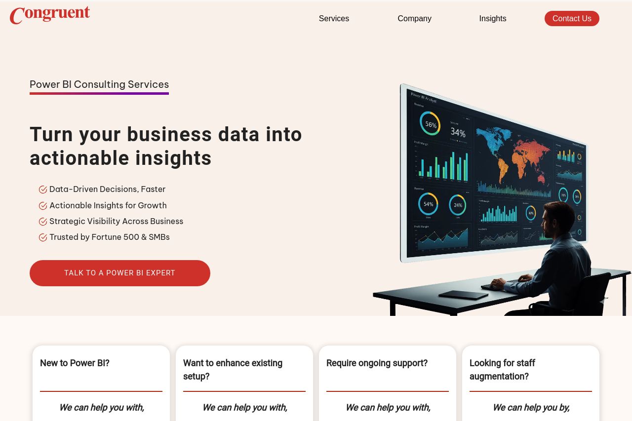
The landing page for Congruent Software's Power BI consulting services shows potential but could use substantial improvements to maximize impact.
Good Points:
- Clarity and Focus: The value proposition is clear, focusing on actionable insights and strategic visibility. Its repetition and reinforcement through different touchpoints help in creating a strong narrative.
- Social Proof: The page effectively uses client logos and mentions Fortune 500 companies, adding credibility.
- Design Consistency: The overall style is consistent, with cohesive use of colors and imagery portraying a professional appearance.
- Action-Oriented CTA: Repeated CTAs create multiple conversion opportunities.
Bad Points:
- Generic Messaging: Despite a well-defined value proposition, the messaging feels too generalized at times, lacking specificity that could better engage IT decision-makers.
- Visual Clarity: Certain sections are cluttered, like the CTA multiplex and icons, which create visual noise.
- Navigation and Headings: Sections lack memorable headings, and navigation could benefit from more distinct transitions.
- CTA Visibility: Although present, CTAs could stand out more with better color contrast or placement for higher engagement.
- Readability Challenges: Dense paragraphs and some technical jargon might deter less knowledgeable visitors. More breaks and simplified language would be beneficial.
Main Recommendations:
- Enhance CTA visibility with contrasting colors and strategic placement.
- Refine messaging to cater more specifically to IT decision-makers, adding industry-specific use cases.
- Improve readability by breaking down dense text and reducing jargon.
- Enhance navigation flow with more distinct section headings and logical transitions.
- Simplify visual elements to reduce clutter, focusing on a more streamlined look.