x20.io
Landing Page Analysis
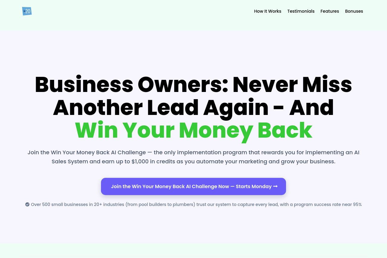
AI Win-Back Challenge Landing page
74
Generated on:
October 24, 2025Score:
74/100Audience:
Business OwnersShare on:
Summary:
70
Messaging
75
Readability
68
Structure
60
Actionability
65
Design
85
Credibility
The landing page has a strong start, directly addressing business owners and immediately showcasing urgency with a countdown. The use of bold headlines and ample spacing effectively captures attention, but the offer might feel a bit too good to be true, potentially inducing skepticism. The trust section with logos builds credibility, yet the page occasionally feels cluttered, especially with multiple similar CTAs. While testimonials convey positive experiences, some areas suffer from excessive text, making it overwhelming. Overall, it's a mixed bag balancing decent visual appeal with a need for clearer structure and refinement in messaging.
Main Recommendations:
- Simplify the text in sections such as testimonials to improve readability.
- Differentiate the CTAs to avoid overwhelming users with similar actions.
- Enhance the visual hierarchy by emphasizing key information distinctively.