portfoplus.com
Landing Page Analysis
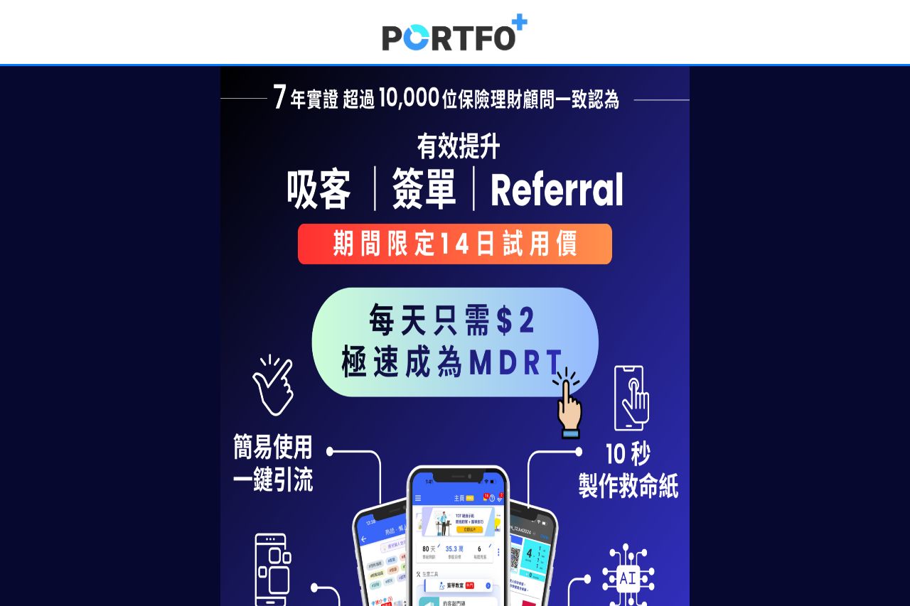
立即加入5000+專業理財顧問的選擇!每日僅需$2,立即開通 PortfoPlus 14天全功能體驗。從高效製作「救命紙」、最新吸客懶人包到強大的 P-FIN 保費融資計算機,一站式平台徹底優化您的服務流程與客戶體驗。這不僅是工具升級,更是您提升專業、節省時間、邁向頂尖顧問的關鍵策略投資。
Summary:
The landing page attempts to present a professional image by highlighting its partnerships with notable companies and using a consistent color scheme. However, it disastrously falters in clarity, with content that looks incredibly cluttered, crammed, and visually chaotic. The messaging lacks punch due to overwhelming text and scattered images which dilute any persuasive power it might attempt to exert. The structure is haphazard - it's hard to trace a logical flow through the content, and critical information is not surfaced effectively at a glance. The random images and awkward layout make it even harder to navigate and understand the offering quickly. CTA buttons are present but lack prominence and urgency. The attempt at credibility through testimonials would be somewhat more convincing if they weren't buried amongst everything else.
- Simplify the layout to reduce clutter and make navigation clearer.
- Create a more focused and prominent CTA with urgency.
- Strengthen the value proposition by making it more concise and impactful.