paraninfo.com
Landing Page Analysis
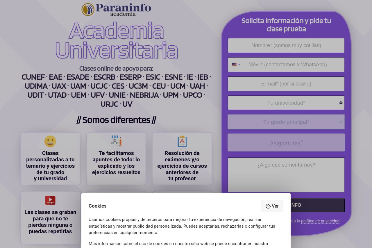
Aprueba tus asignaturas de universidades de Madrid con tu temario. Academia Universitaria Paraninfo.
Summary:
The landing page attempts to present a supportive educational service for university students in Madrid, but fails in several crucial areas. The design tries to capture attention with a bold color scheme and clear form, yet it struggles with alignment and relevance. Messaging is a core flaw; the value proposition is scattered and lacks a strong, cohesive narrative. While it highlights different universities, it seems cluttered, failing to focus on a deeper connection with the target audience. The readability is another issue; the clutter and font size make reading a chore, and the form fields are overwhelming. Additionally, credibility elements like testimonials do not stand out, and while present, they do not enhance trust significantly. Actionability is mediocre at best, with call-to-action prompts blending poorly into the background, offering little urgency or incentive. The layout is disorganized, making navigation tedious, with information buried in text blocks rather than highlighted for easy access. Design consistency is lacking, with scattered imagery and uneven typography failing to establish a clear visual identity.
- Streamline messaging to focus on a single, powerful value proposition.
- Improve visual hierarchy by adjusting font sizes and colors for key elements.
- Enhance call-to-action buttons to be more noticeable and concise.