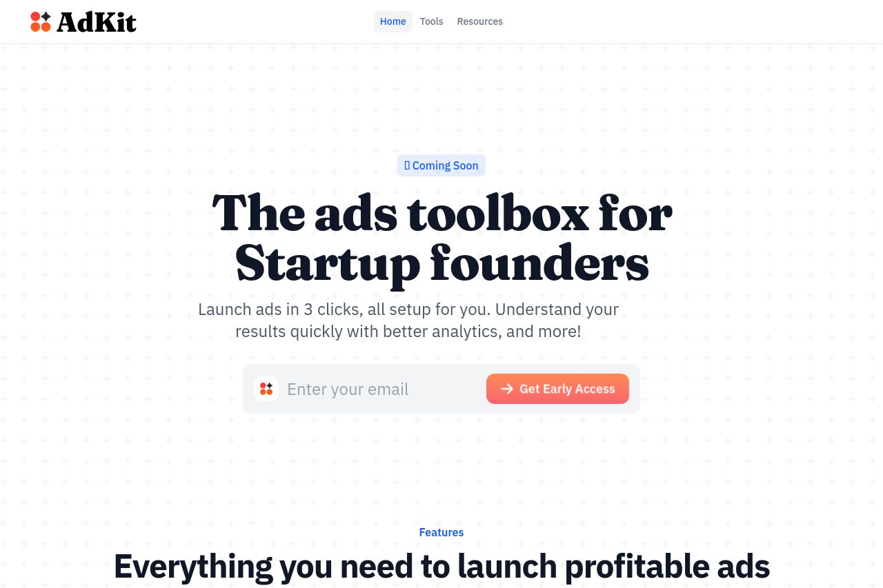
adkit.so
Landing Page Analysis
The Ads Toolbox for smart founders

Summary:
AdKit's landing page offers a solid foundation, but it could use refinement to maximize its potential. The main value proposition targets startup founders, clearly attempting to differentiate itself as a comprehensive ad toolkit. However, the striking lack of any compelling graphics or images makes everything feel flat and uninspiring. The text is straightforward, but overuse of bold and large fonts creates a shouting effect. The layout maintains decent readability, yet sections feel overly simplistic and the CTA isn't strategically aligned with user flow. The lack of testimonials and trust indicators is another glaring omission, impacting credibility. Overall, the design is minimalistic but not engaging enough to retain attention or drive conversion effectively.
- Incorporate engaging graphics or icons to add visual interest and clarify offerings.
- Integrate testimonials or customer logos to enhance trust and credibility.
- Refine the CTA placement and language to align better with user intent and flow.