biller.uy
Landing Page Analysis
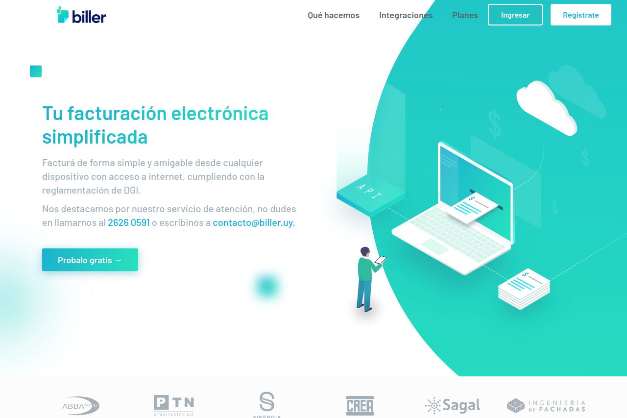
Biller es un sistema de facturación web fácil de usar que le permite facturar de forma tradicional o electrónica cumpliendo con todos los requisitos de la DGI.
Summary:
The Biller landing page offers a generally solid presentation, but there are key areas that need improvement.
The design is visually cohesive with a clean and modern look, though some sections feel overly text-heavy, which affects readability. The value proposition is articulated, but could be more pronounced in differentiating itself from competitors. CTAs are clear and prominently placed, yet lack a sense of urgency or excitement. The information flow is logical, but might benefit from additional engaging visuals or demos. Trust elements like logos and testimonials bolster credibility, but further professional and transparent details could be added in places, such as more conspicuous contact information or founder details.
- Enhance clarity and urgency of CTAs to motivate immediate actions.
- Simplify text-heavy sections to improve readability and engagement.
- Include more dynamic visuals to clearly demonstrate product functionality.